As a keen photographer I love looking at images. I have a variety of sources to feed my need for regular photography inspiration: Flickr, 500px, twitter, blogs and so on. One of my favourite sources of inspiration is seeing the amazing photojournalism shots that show what’s been happening around the world.
As with all experiences on the web, some websites make life easy for users and some make reaching their goal a little more difficult. Often we find that this will depend on how much they have prioritised their business goals in comparison to their user goals.
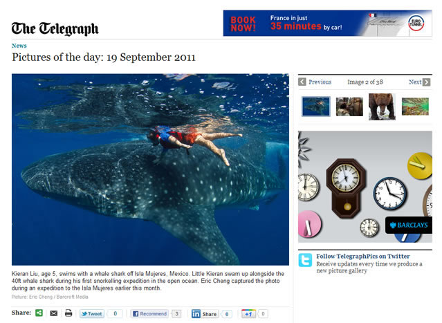
Last year we looked in depth at The Telegraphs Picture of the Week and felt disappointed with the experience. Although they had some great quality photography, enjoying it was frustrating. They focused more on satisfying their own business needs and not going far enough to satisfy their user’s needs.

Advertising took attention away from the main image
It’s easy to understand why they had the advertising, I don’t like it, but I live with it. But as a user I don’t want it to distract me from why I’m on the page. The moving images in the ads meant I struggled to pay attention to the image and the description that goes with it. If you display ads on your site, use static ads over animated ones.
Navigating to the next image was not easy
The next button was small and poorly positioned (see top right of the screenshot above), meaning the main image and the ads draw attention away from it. Even though I’d used the site many times, I still struggled to notice that there was more than one photo available, and it took me a while to see where I could see the rest. The next button should have been obvious and intuitive.
In addition, clicking the next button meant the whole page refreshed. This was great for the product manager to track their stats and see how they were performing. It was also great for the sales team who were selling the ad space. But it was not so great for the users who didn’t want to have to wait for each page to load and new ads to refresh to distract them even more.
Seeing the images in all their glory was not possible
Finally, there was no way to see the images in full screen to make the most of the beauty on display.
For me as a user, the Telegraph came up short in terms of user experience and in the current climate newspapers must deliver a strong business proposition alongside an excellent user experience. They can’t afford to get this wrong
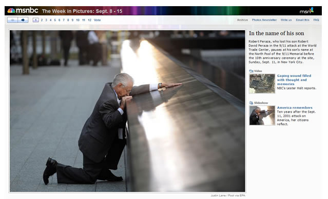
In our review last year, we contrasted the Telegraph experience with two sites that seemed to have got the experience right: Time.com and MSNBC.
On Time.com there’s a nice clear option to view the image full screen and the page is designed to ensure the main focus is on the image with little to distract users from it. In addition, on rollover there’s an obvious next button to move to the next image. (It should be pointed out that there were rollover next buttons on the Telegraph site but these were small and easily missed). It’s easy to appreciate the photography on Time and moving from one image to another is simple and seamless.

The MSNBC site has a lovely large main image again with little visual clutter to detract from it. The next buttons would be better placed below the image, but nevertheless they are still relatively easy to notice and their function is clear

Clicking Next on both Time and MSNBC refreshes the image quickly and doesn’t load a new page. It should also be noted that whilst MSNBC does have an advert on the page it is below the image, it is not animated and doesn’t distract from the experience.
The Redesigned Telegraph experience
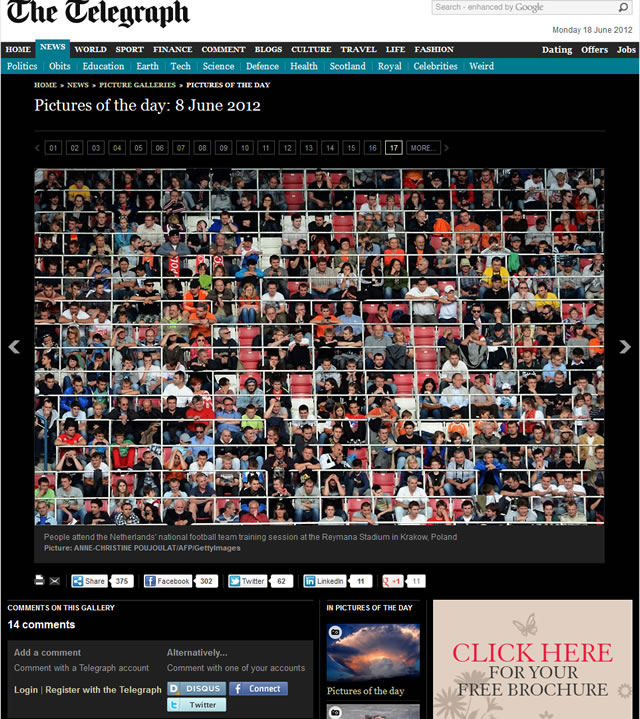
We were interested to see that a lot of our recommendations that we made last year were taken on board and the results are pleasing. The site is now focused more on satisfying user’s needs rather than just their own business goals.

Advertising has been deprioritised to the bottom of the page
Although it’s still on the website, the large advertising space has been moved to the bottom of the page and is less distracting. Yes, it still uses moving images but moving it below the page break means that it no longer competes for users’ attention when viewing images.
Navigating to the next image is now much easier
The next button has increased prominence on the page and its placement to the right of the image is more intuitive. To further help users navigate, thumbnails are visible on rollover for previous photos allowing users to hover their mouse over the thumbnails to find interesting images without having to click and view each image.
We were also happy to see that when clicking the next button, only the image changes and not the whole page. This provides a seamless transition for the user without having to wait for the pages to reload. Also, the marketing teams can still track visitor stats and the adverts still change when viewing each image which increasing the amount of adverts that can be shown on the page.
In Summary
Hopefully, The Telegraph has learnt a useful lesson: By focusing too heavily on their business goals, they created a negative impact on their user experience. The obvious irony here is that by focusing too much on their business goals meant ultimately they were not being realised hence the need for a redesign. Neglecting user goals in favour of business goals will never work and leaves it open for competitors to steal away your users until you are forced to redesign your website to redress the balance.
