If you live in the UK, you’ll be hard pressed to avoid The Olympics at the moment. One of the main talking points, certainly for Londoners is the traffic nightmare expected to jam the roads, underground, buses and trains. In anticipation, the powers that be have set up a website which is advertised to help people avoid traffic chaos: www.getaheadofthegames.com.
Unfortunately, we feel the website doesn’t live up to the hype and we’re surprised the user experience was so poor. Instead of moaning about it, we thought we’d use it as an example to help you avoid similar user experience issues cropping up on your website.
1. Your homepage should focus on building credibility and leading users to the main reason for their visit
Your homepage should deliver a clear, coherent message about who you are and what you offer. Any confusion or mixed messages lead to high bounce rates as users click the back button to return to the search results.

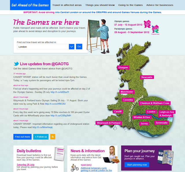
The first impressions of the getaheadofthegames.com website are that it looks like some kind of affiliate website. The use of clipart and the cheap looking logo don’t foster immediate credibility. In addition, the huge map of the UK and live twitter feed capture attention but offer very little value to the first time user who is most likely looking to plan a journey in a specific area. Although the dropdown is placed high up on the homepage to allow users to filter by their location, this could be missed by users as the pink headings, blue buttons and large green and pink map dominate attention.
The ‘plan your journey’ which we anticipate to be the biggest user requirement for the site is given much less priority in the design by being placed in the bottom right corner. Even less prioritised are the official logos behind the site, which are placed at the bottom of the page.
Its so important to establish credibility quickly. If we were working with getaheadofthegames.com we would recommend that they reorganise the layout of their homepage to de-prioritise the map and twitter feed, and instead boost the journey planner and spectator user journeys.
2. Check that any advertising and call to action buttons deliver what users expect
When setting expectations in advertising or even in the labelling on a call to action button, be sure to deliver on that expectation. If you offer a ‘book now’ button make sure users can actually start booking straight away after clicking that button.

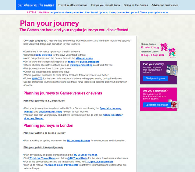
We would expect most people coming to the getaheadofthegames.com website to be focused on solving a travel related problem. They are likely to be either looking for the best way to travel to the Olympics as a spectator, or as far away as possible so they can travel freely to their destination. Although the site offers links to ‘plan a journey’ and ‘are you a spectator’ clicking on those links takes users to a page full of text and links to other websites.
If you set an expectation in an advert or other marketing material which promises to solve a problem for your customer, make sure you can easily deliver the solution. The getaheadofthegames.com website offers help but then passes the buck and links off to several different sources. This is likely to frustrate and overwhelm users looking for a simple answer to their travel problem. We would recommend that the getaheadofthegames.com website worked more closely with other content providers to embed journey planning tools into the site rather than linking off to a variety of different locations.
3. Don’t blow your budget on ‘cool functionality’ which doesn’t offer a great deal to users
Although you and your team may be excited by some funky new gadget, widget or tool, be very clear with yourselves on the reasons why you are including it in your site. If the honest answer is that you think its cool and you want to learn more about it, you probably shouldn’t do it. Focus on whether it will really solve a problem that users need solving. When we conduct user experience research, we often speak to clients confused why their site isn’t delivering on their business objectives. When we delve a little deeper, we find that users don’t use the features they spent most of their budget and attention on developing because they don’t see the value.

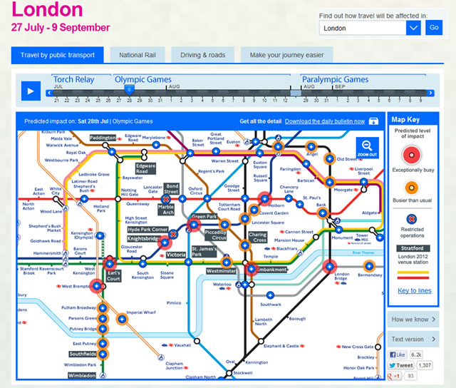
Sadly, getaheadofthegames.com have clearly spent a lot of resources in developing a nicely designed, very visual, interactive travel disruption tool. Sure, it looks good and works seamlessly, but do users really need it? If you’re trying to get from Waterloo station to Russell Square, do you really need this tool to tell you that stations on the District Line from Wimbledon to Earls Court are likely to be much busier than normal? Showing the whole underground map with a date slider at the top looks interesting, but the amount of information displayed is overkill for the average user. Is this a case of designing a cool tool, but not thinking about how much it actually solves the problem users face?
Perhaps we’re being a little harsh but we believe that simply focusing on core user needs will lead to innovative features and functionality which are exciting and really useful. If we had been involved in the getaheadofthegames.com project we would have made sure we fully understood user requirements at the outset to ensure all features and functionality were clearly mapped to priority user needs.
How to take action on your website
1) Take a look at your website right now. Ask yourself, does your homepage demonstrate how credible you are? This is particularly important for the lesser known brands. Do you make a case for why users should stay on your site? Now take a critical look at whether you’re offering a simple next step for users to start their journey. If there are more than 3 things shouting for their attention you probably want to remove the less important ones.
2) The next thing on your to do list is to take a look at whether your promises in adverts are actually realistic. Take a look at your print adverts, your banner ads, paid search ads, email marketing, and any other marketing material. Are you setting realistic expectations for users? Does your site really deliver? Now take a look at the journey from the ad through to your website. Is the journey simple? Does each step make sense? Do call to action buttons deliver on expectations? Can you remove unnecessary distractions?
3) The final thing you can do is less immediate. Next time you’re in a strategy meeting discussing planned changes for your site. Look out for any suggestions of cool content or functionality and ask if users really need it. If in doubt, ask for some budget to do some user research to clarify whether users really need it.
Running a website that really helps users is tough, and websites like getaheadofthegames.com are a good example of what to avoid.
