The temptation for many ecommerce websites is to simply follow convention by creating a site using a familiar design approach. Whilst we certainly wouldn’t advocate throwing away a tried and trusted ecommerce formula, we wanted to share some examples of how you can break convention and deliver an innovative and stylish shopping experience.
The five examples we have shared in this article utilise beautiful design and subtle but innovative interactions to enhance the user experience. We’ve broken down the core user journey from the landing page through to the checkout and provided example videos demonstrating an unconventional approach.
1. Homepage or Landing Page
The use of a large, full screen engaging video on the Storq homepage compels the visitor to watch and then explore the site further to see the rest of the products. This novel approach breaks convention for most ecommerce homepages but manages to offer a simple, easy to use experience which is fun and engaging.
2. Product Listing Page
The large imagery used on the Anyi Lu site allows users to focus on the detail and quality of the products. The blurred effect on rollover and the need to interact to show pricing, gives a luxury feel to the site. Lack of price, product description, or reviews and ratings gives a really clean minimal feel. The design feels just like a good luxury store which is careful to help you when you need it, but not to make you feel pressured into making a decision. The user experience facilitates a much more visual browsing experience than the more traditional ecommerce site, which encourages shoppers to filter product categories and compare features.
3. Product Detail Page
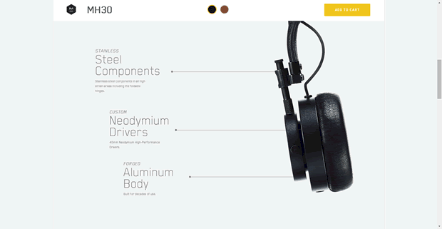
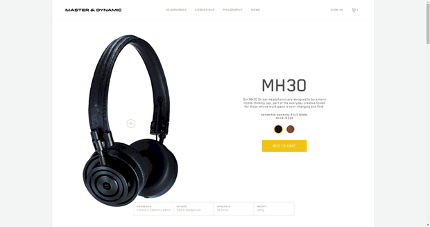
As we saw on the Anyi Lu product listing page, large quality images give a real luxury feel to a site. The Master and Dynamic site offers a clear, simple presentation of product specifications, making the information quick and easy to digest. The large, prominent button is well contrasted to the simple page and so draws attention well.
Scrolling down the page goes into more detail on the different aspects of the product. As you scroll a different feature is highlighted with others fading back, which offers an excellent example of design and usability working in harmony. The ‘add to cart’ button is persistent throughout but is now in the top banner, out of the way of the browsing experience.
4. Add to Basket
Adding to basket on the Anglepoise website transitions the page to pull in the basket from the right hand column. To indicate the change, the focus of the page shifts towards this area. The great thing about this is it removes the need for a separate basket page and allows users to stay on the product page. One click into the product page removes the basket so the user can continue shopping. There is a clear call to action to ‘checkout’ allowing users to complete their purchase when they are ready to.
5. Product Page to Checkout
This last example from Big Cartel wraps up a number of good examples into one process. The product page is simple and clean with an innovative way of demonstrating product stock levels. The checkout is a great example of an easy to use one page process, with minimal design to reduce distractions and keep users focused on their purchase.
Summary
The websites outlined in this article offer clean, minimal designs which deliver engaging and enjoyable shopping experiences. These sites keep visual clutter to a minimum and experiment with different ways to communicate those finer details like sizes and product materials. It’s refreshing to see ecommerce sites unafraid to break convention in favour of better user experience.
Would you like to improve your ecommerce user experience? Get in touch for an informal chat with one of our ecommerce usability experts to find out more about how we can help.
