Between projects we like to set up A/B testing experiments on our website which test theories and ideas that come up during client work. Our latest experiment focused on how to encourage users to download a free guide by testing the differences between a large call to action box versus a smaller one. Rather than worry too much about getting the design and styling right, first we wanted to test out which would generate the most conversions and then adopt an ongoing agile approach to eventually lead us to the right solution.
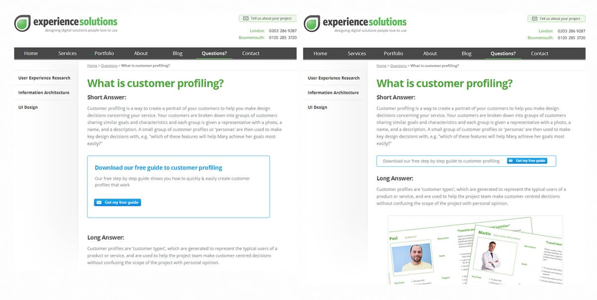
Which test do you think would convert better?
In true ‘which test won’ style, take a look at these two pages and take a stab at which test you think would convert better (the winner will be revealed later in the article):
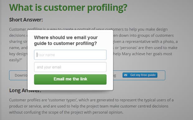
Before we went live with our test, we spent some time plotting out the user journey and the key steps visitors would go through to get the customer profiling guide (the conversion goal). We brainstormed different mechanisms to capture email addresses which would not take users away from the page they were on. We felt that a button which triggered an overlay would allow users to complete the process in context without having to move away from the content they had originally visited.
Focusing on strong call to actions
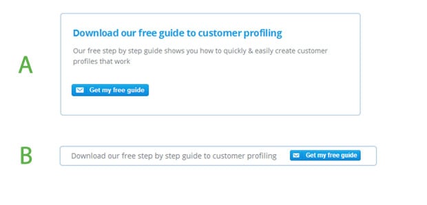
During the wireframing stage we felt that the larger call to action box (Test A) was more likely to convert because it draws user attention and offers more detail on the benefits of downloading the free guide. We wanted to test this alongside a smaller, less intrusive box (Test B) which did not push the page content down and take up too much space.
Putting it into action
With our hypothesis set, we quickly converted our wireframe mockups from the whiteboard into html. Within a couple of hours our two pages were set up, the tracking code was implemented and google experiments was up and running; sending our traffic to the two versions of the what is customer profiling? page.
The results are in!
After a couple of weeks of letting the tests run we were surprised to find that the smaller box (Test B), outperformed the large box with almost double the amount of conversions:
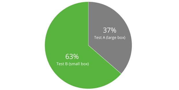
This was interesting because typically in usability testing we see that larger, clearer choices for users perform better than the more subtle ones. This just goes to show how dangerous assumptions can be in web design.
A/B testing is excellent at telling you the facts, but it has no ability to answer that all important question: why did the smaller box convert better than the bigger box?
Next steps: Testing simple copy changes
So, whilst we didn’t fully understand why the smaller call to action box worked better, we felt that we had enough evidence to conclude that the next set of tests should be to test the wording used in the box, and then after that test was complete, we could look at the design and styling of the box and button.
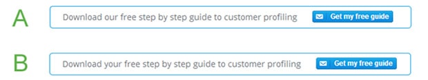
We’re now testing a simple wording change to see if the change in emphasis from ‘our’ to ‘your’ makes a difference. We’ll update you with the results once we’ve completed the experiments.
Summary
What we find really valuable in our agile A/B testing approach is that we can quickly test out our ideas without having to worry about perfecting each option. We focus on the overall direction and then with each experiment we can refine the details until we have a direction we are confident in. Once we have that, we can roll it out to the rest of our site in A/B tests against our existing content versus the winning, fine-tuned design from these tests.
We wanted to share this approach as we often find that our clients want to polish everything and make their options perfect before they are tested. Yet we find there is much more value in testing rapidly and advancing incrementally rather than spending too much time perfecting two different options.
Key Takeaways
- Agile A/B testing is a useful approach to quickly test ideas out before spending effort on one direction over another.
- A large call to action box or promotional feature may not be the best approach, though more research is needed on this.
- Assumptions can be dangerous and mislead you into making the wrong choices for your website.
- A/B testing, while useful, will only give you half of the picture. You will not know why one version worked better than another without usability testing or other user research tools.
Can we help?
Are you spending too much effort perfecting rather than testing? Then give us a call. We are experts in conversion rate optimisation and usability testing and can help you find the best solution for your business.
