According to Insurance Business Online, last year 69% of insurance policies* were acquired online, yet we see many users struggling with the usability of quotation processes in usability testing. Insurance companies still neglect the quotation and application process on their websites and present poorly designed, unintuitive and confusing forms to their prospective customers which in turn could see them missing out on conversions.
In this post, we analyse the life insurance quote process of 14 leading insurance companies and comparison websites to see which sites offer the overall best usability and user experience. We also provide explanation as to what makes a good quote form and how insurance companies can consider implementing changes on their website.
Measuring usability
Our first challenge was to determine how to best measure the usability of the quotation forms and create a score to benchmark one insurance company’s quote process against another.
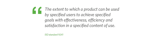
Based on the ISO standards 9241, which defines usability as the combination of effectiveness, efficiency and satisfaction, we decided to rate each website on these core areas. The average of these scores would therefore provide us with an overall usability score which we could use to benchmark each website.
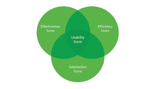
- Effectiveness:We measured whether users could successfully complete the quote process and answer all questions without making any errors
- Efficiency:We measured the time it takes to complete the quote process, the number of questions asked and the number of steps involved
- Satisfaction:We measured users perception of the effort it took to complete the quote process and how easy or difficult it felt
The Results
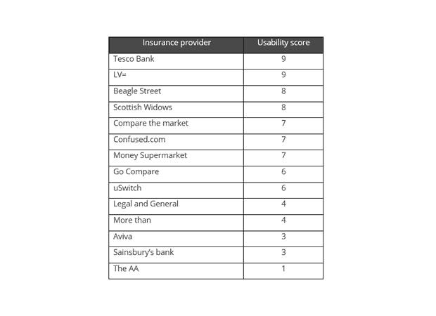
The results of this study surprised us! We thought that the leading insurance companies would offer the best experience as they had the resources and budgets to invest heavily in getting this important process right. Apart from LV=, the biggest names, Aviva and Legal & General, scored poorly and some of the smaller lesser known insurance companies such as Beagle Street offered a better overall user experience. Here is our ranking of how each insurance company and comparison website performed:
Key learning points
Based on our findings, we have created six key learning points that insurance companies can use to ensure that they are offering the best experience to their potential customers.
1.Keep the quote form simple and only ask relevant questions
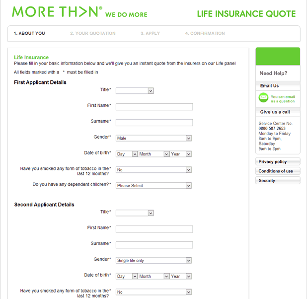
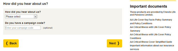
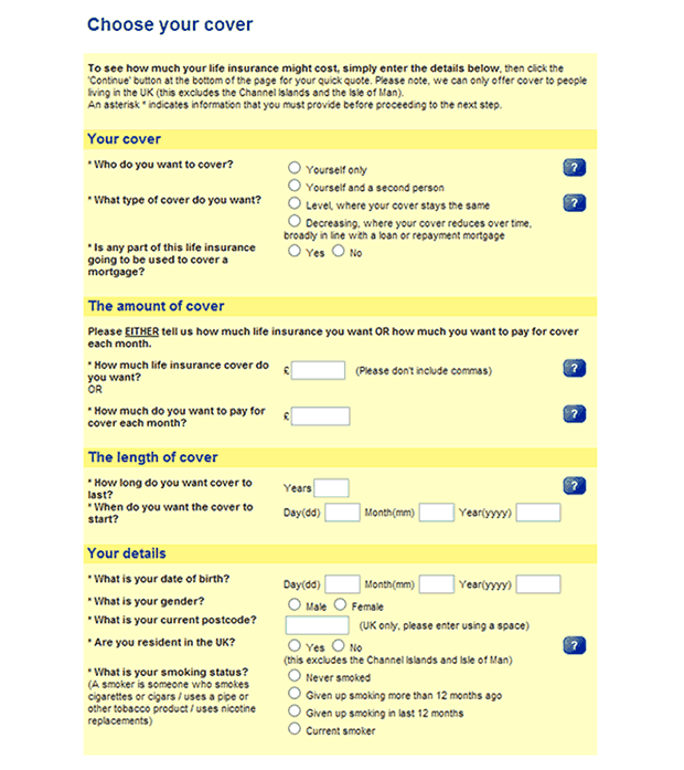
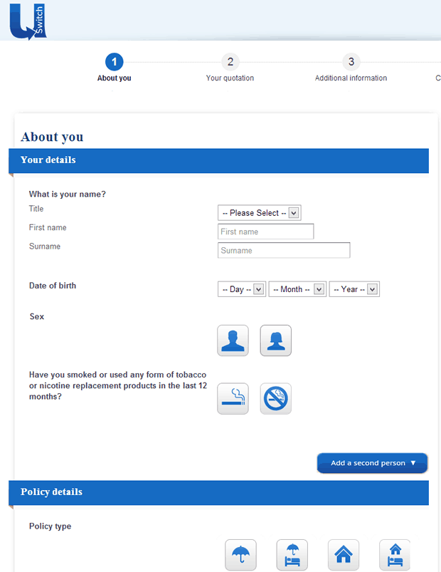
Most insurance companies that we reviewed added extra fields that were not required for a quote. This tended to increase the time to complete the task and introduce more potential for errors and abandonment. For a quote, name and address details are not required (though we understand the business case for wanting these, we feel these could be captured more intelligently). Equally asking users how they “heard about you” at this stage in the process just adds to the frustration, and in our experience rarely gets completed honestly by users just wanting a quote. Questions not required for the quote, such as personal details could be asked later during the application process once users have decided to proceed.
The insurance companies that offered the best experience only asked the essential questions that were required to get a quote, namely:
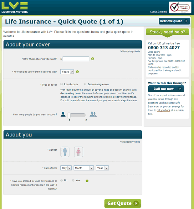
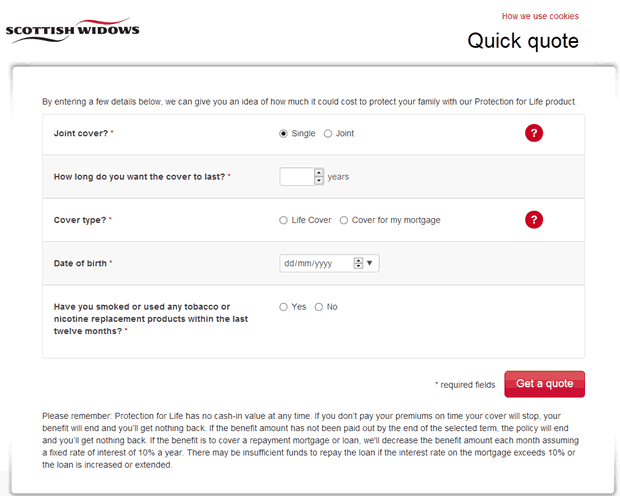
- Type of cover required
- Amount of cover
- Term
- Number of people to cover
- Gender
- Date of birth
- Whether applicant was a smoker
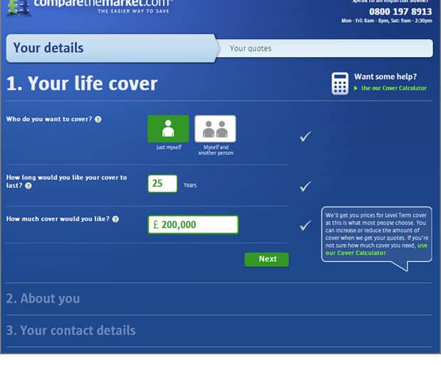
LV= and Scottish Widows have a single page quick quote process which only asks for the minimum information.
2. Do not ask for personal information during the initial quotation process
During usability testing we have conducted on insurance websites, one of the main frustrations users complain of is having to provide personal details in order to receive a quote. Most have concerns about giving their phone number or email address in fear of receiving unsolicited emails and phone calls. This is a significant barrier to conversion which sees them abandoning the quote process in search of another provider who doesn’t require personal information before they get a quote.
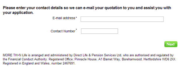
Insurance companies would increase their conversion rate by removing fields that ask for personal information from the quote form. Users will be more inclined to give their email address willingly once they are shown a quote price if they are offered to have the quote emailed to them.
3. Don’t assume your users know your products
Several insurance companies we reviewed assumed users had read and understood their company’s specific life insurance products and had already made a decision which plan was best for them. Users were presented with a dropdown menu during the quote process asking them to select which life insurance product they required.
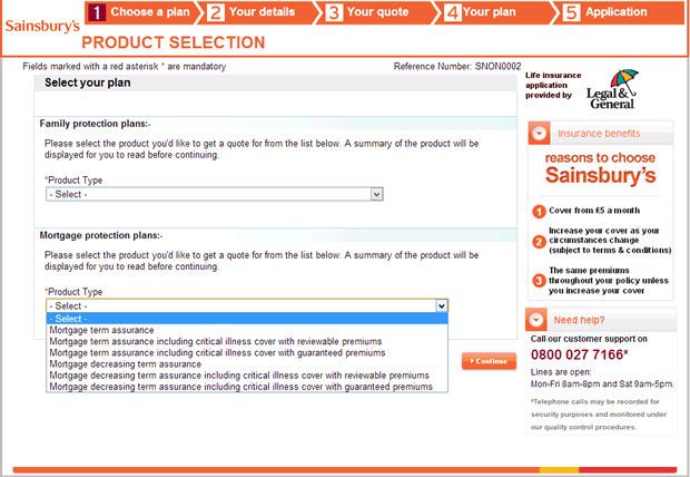
In reality most users will jump straight to get a quote before reading any contents on the website and would be unsure when they are required to select a suitable product from the list.
If users are required to know certain information about your products before the quotation process, make them aware of this fact before they begin the process. Better still would be to offer help during the quotation process that explains the options available to them. Tesco Bank and Money Supermarket provide help during the checkout process to make answering some fields easier.
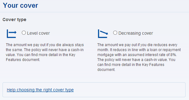
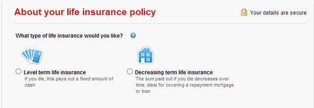
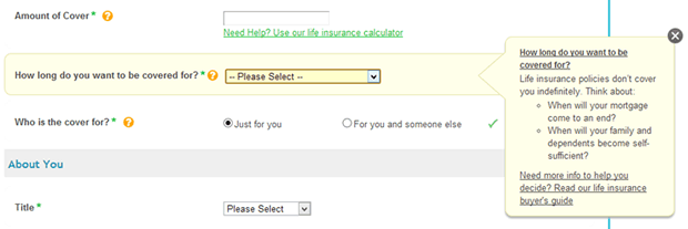
4. Provide tools or calculators to guide users when completing the form
The websites that offered a better experience offered tools and calculators during the quotation process that would guide the user when answering questions. For example some users that are taking life cover would not understand some important aspects, such as the amount of cover they would need and would have concerns that they were either under-insured or unnecessarily paying more in premiums. Money Supermarket provides an excellent example of a useful tool which helps users calculate the right amount of cover for their personal circumstances.
5. Provide useful contextual help during the quote process
Although most quote forms provided some form of help tool tips, the insurance companies that offered the best experience provided useful and concise contextual help. This help should be displayed automatically when users click into the specific field and should provide additional information about what is required and more importantly why it’s required. Where further explanation is needed the tool tip should provide a link to further information.
6. Ensure the form layout is intuitive and appealing
Most people don’t enjoy spending time filling out insurance forms and want to get it over with as quickly as possible. Some of the websites we reviewed added to the pain by displaying difficult-to-use and complex forms; with long text heavy questions and poor design with misaligned fields, which would lead to frustrated users who are more likely to abandon the form. Aviva’s example below was a particularly poor example of form design.
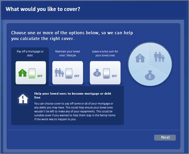
However form layout and design doesn’t have to be boring or dull. Some of the websites that we reviewed have found creative ways of gathering information to make applying for a quote for life cover almost enjoyable. Although there were several, here are a couple of the best examples of websites that offered a well-designed and creative quotation process:
Conclusion
In the ever increasing competitive world of insurance, where there is little to no differentiation between one provider and another, a key area where insurance companies can increase market share is by making quote and application process as intuitive as possible. We believe that these six tips will improve the overall user experience of the quotation form on insurance websites.
* 69% of new and switched motor and household insurance policies
Key Takeaways
- Keep the quote form simple and only ask relevant questions
- Do not ask for personal information during the initial quotation process
- Don’t assume your users know your products
- Provide tools or calculators to guide users when completing the form
- Provide useful contextual help during the quote process
- Ensure the form layout is intuitive and appealing
Want to know more?
We are experts in usability and have worked with many financial services companies to help them improve the online experience of their users including LV=, Churchill and UIA Insurance. If you want to find out how we can help your business then get in touch for an informal chat
