Attend any business development or marketing seminar and you’ll hear the term ‘perception is reality’. This refers to the general principle that what the customer perceives about your business, website, product, etc., is effectively what it is. No matter how you present your product as ecologically sound, your staff as friendly, your business practise as ethical; if customers perceive it differently, then the image you wish to present is an illusion. The only thing that matters is what customers perceive to be true.
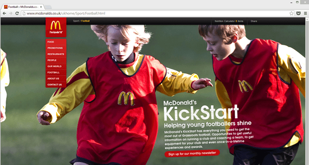
This is why companies like McDonalds spend millions of pounds investing in various sports programmes, why they sponsor healthy eating initiatives, and why they advertise salads and wraps over their more popular but less healthy alternatives. McDonalds know that customers perceive them as unhealthy, so they are trying to change customer perceptions. Is it working? Ask around, what do people you know perceive about McDonalds? That will give you the reality.
If your site looks difficult to use, it might as well be
So what has McDonalds got to do with usability? Because the same principle is true on your website – perception is reality. If users perceive your website to be difficult to use, they won’t bother to use it. At the first hint of complexity, many users jump back to Google in search of an easier ride.
In usability tests, when people have told us that they would leave the site at the point of poor perceived usability, we’ve encouraged them to continue and give it a try anyway. More often than not, the process was a lot easier than expected, but their perception overruled the reality. No matter how easy to use your site is, if it looks like it will be difficult, it might as well be.
Simple changes to the visual presentation can make a form more inviting
Visual design is the key influencing factor in whether something appears to be easy or difficult to use. The use of white space, the readability of the font, how balanced the visual elements are, and how clean and simple the layout is will all contribute to perceived usability.
A good example of perceived usability is with the Cyclescheme.co.uk website. The site encourages employers to register to allow employees to buy cheaper bikes and cycle to work. Clicking on the ‘register’ link, employers are presented with a complex looking form with poor perceived usability:
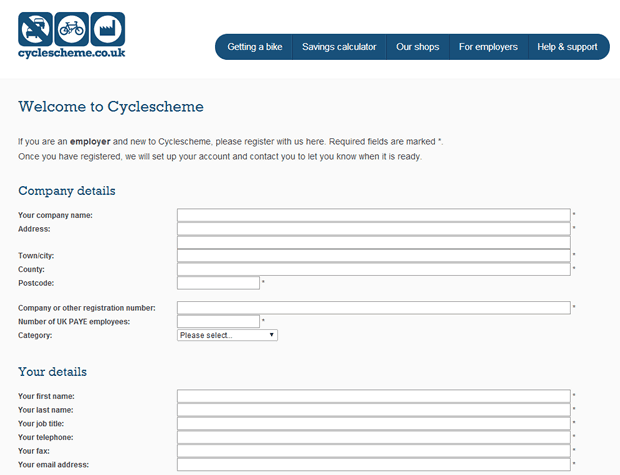
As the page loads, most users at this point will weigh up how much they want to invest in completing a complex looking form. The entry fields are very long and close together, giving the impression that you have to fill in a lot of information. We would expect a high percentage of users leaving the site at this point. However, in reality, completing the form wasn’t too difficult.
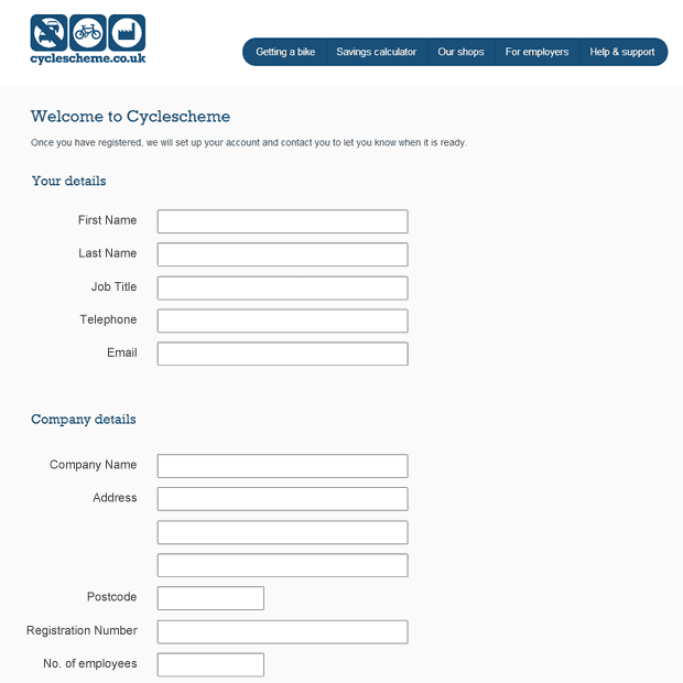
Some simple design changes to the form could increase perceived usability, and we believe would increase the amount of form completions. All we did was increase the font sizes, increase field height and decrease field widths to give an easier feel. Right aligned labels and a small increase in white space makes the form seem simpler. Finally we moved the ‘your details’ to the top as this is an easy place for people to start. Those simple changes combine to make the form feel easier and more inviting, when in reality the content is pretty much the same.
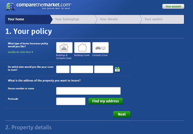
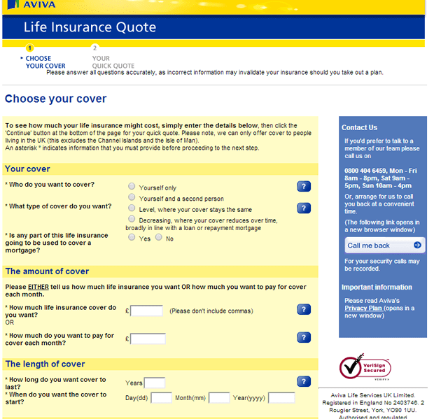
Compare The Market vs. Aviva
A great example of a simple looking form is provided by Compare The Market. The design of their quotation form is presented in a simple, almost playful manner which encourages users to interact with it. Compare this with most insurance quotation forms (i.e. Aviva) and you’ll see a huge difference in perceived usability.
Perceived usability can affect all areas of your website
Perceived usability can have a massive impact on form conversion, but the concept is not just restricted to online forms. How simple something looks has a big effect on almost any aspect of web design. For example, gov.uk does an excellent job of making a dry, complex topic area look inviting and easy to read:
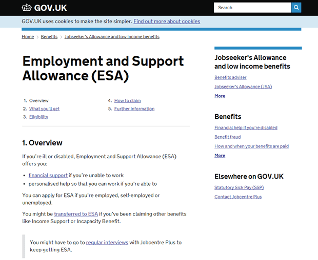
Again, the content feels easy because it is presented in digestible chunks. There are clear headings and sub headings, with good white space surrounding them to allow for easy reading. Sentences are not too long, and the information is bulleted and made to look visually interesting.
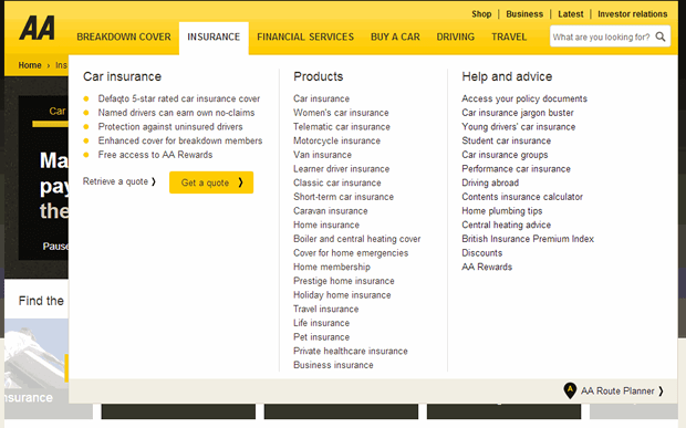
A navigation that looks like hard work will turn away users
Take a look at The AA’s dropdown menu. The menu feels like it will be hard work to use. All the products are listed close together and in no particular order. At this point, using the site feels like it is going to be difficult and depending on how they are feeling, users may decide to leave the site in favour of an alternative.
In comparison, take a look at Confused.com and Tesco Compare. Both websites make an effort to make product selection easier for users.
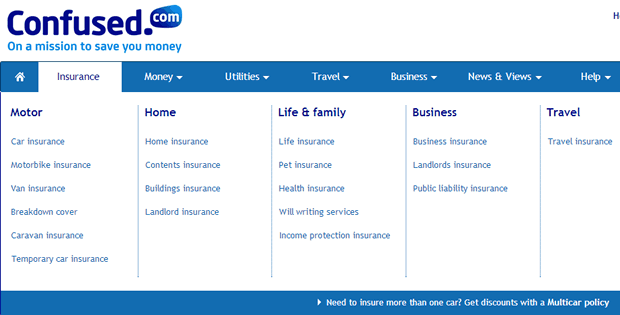
Confused.com breakdown their different products into categories with clear labels, and good white space.
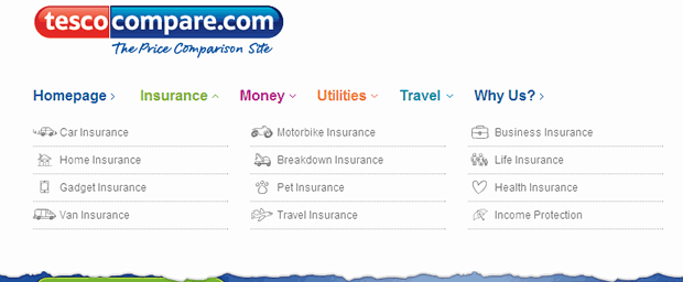
Tesco Compare opts for iconography and a 4×3 grid to make product selection feel easy for users.
Summary
The visual design of a site is, of course, an important aspect of the user experience; but often designers and clients find it difficult to put into words. The examples outlined above show the importance of good design and how it can influence users’ willingness to persevere with a website. As with everything, it’s never that simple. Simply making something look easy is not going to save your site if it has usability issues. It might get more users to start the process, but the true usability issues will turn them away in the end. A coherent user centred design process which focuses on user needs at the start, with the visual design enhancing an already tried and tested experience, is by far the best approach to ensure your site really delivers solid conversions.
Key Takeaways
- If your site looks like it might be difficult to use, you could be losing conversions.
- Improving perceived usability does not have to be a difficult, time consuming process as demonstrated with our cyclescheme.co.uk design.
- Online forms tend to suffer from the effects of perceived usability more than other areas of your site, however content and navigation can also be affected.
We can help boost your conversions
Do you need help to increase your online revenue and conversions? Get in touch for a free informal chat with one of our online conversion experts.
