Last Wednesday saw the launch of the new BBC News App for mobile devices and tablets. The BBC promised it will be a “great experience”, however the reviews in the App store are less than positive with an average rating of currently just 2 out of 5 stars and some very angry reviews. We decided to see what the user experience was like.
More features, more scrolling, a more directed news experience
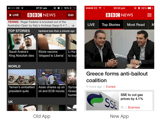
At first glance, the design of the new BBC App (right) is more modern and attractive than the previous version (left). The use of white space and large images make the app feel less cluttered and easy to use. However, the tradeoff of using larger feature stories means that scanning the headlines requires much more scrolling to find the articles you are interested in which can become frustrating. The app seems to have taken on more of an editorial role in telling users what it is important rather than leaving users to decide what they feel is important.
Personalised news doesn’t work as well as it should
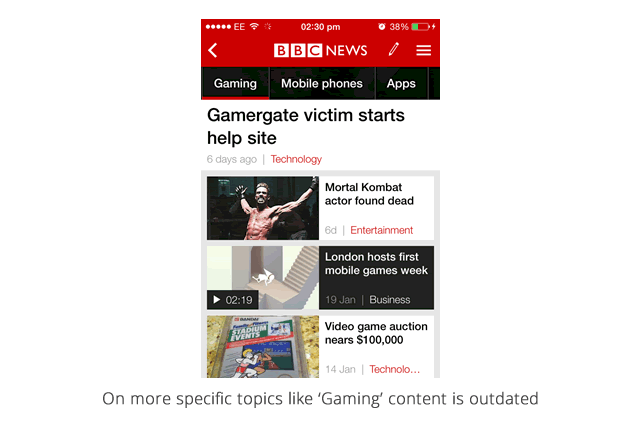
All articles and news stories are tagged and users have the ability to personalise the interface based on broad categories like ‘Football’ or very specific current topics like “Greek Elections 2015”. At first glance this seems like a great addition, however there are hundreds of very specific topics to choose from and some of the more obscure topics have very few recent articles. For example, a topic such as “Gaming” has only a couple of recent articles and is mostly filled with outdated content making the personalisation feel ill thought through.
Slightly awkward navigation
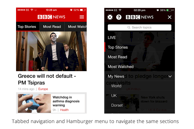
From a UX angle there are a couple of niggles that are frustrating. For a start the navigation is a bit fiddly. Topics are placed as tabs at the top of the page. If you have lots of topics, navigating through the endless list isn’t easy (especially if you have fat fingers like me). They have attempted to solve this by replicating the topics using a more traditional hamburger which provides a list of all your topics but having two ways to navigate to the same content feels a bit odd and almost like it has been added as an after-thought.
Regular updates should be useful but instead they are distracting
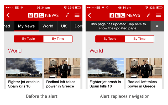
Stories are constantly being updated by the BBC News team which makes the content feel very fresh. This seems like a great idea until you are in the middle of reading an article and an alert pops up warning you that page you are on has been updated. This alert replaces the navigation so before you are able to navigate away from the page you first need to click an x to dismiss the message. This extra step for something as insignificant as the content has slightly been tweaked feels quite jarring.
