Appliances Online, or AO.com, as they are now known, have recently listed their shares on the London Stock Exchange and reached a staggering company value of almost £1.6bn.
How has this business, that was virtually unheard of a few years ago, become the leading supplier of white goods in the UK, while previously big names like Comet no longer exist? According to Matthew Lawson, Head of Conversion at AO.com, one of the reasons for their growth was introducing a user centred design approach to the business.
AO.com asked users – Why aren’t you buying white goods products online?
In the early days, AO.com had one main problem – website traffic was high and whilst users were engaging with the website, they just weren’t converting. To find out why AO.com asked website visitors one key question: “Why aren’t you buying white goods products online?” They conducted hundreds of hours of usability testing and found that a lot of user’s questions during the research phase were not being answered by the website. This forced users to go to a competitor’s store to speak to someone in person. AO.com needed to find a way to help users choose a suitable product using the website.
In this article we will explore how AO.com have improved their conversions by anticipating user questions and answering them on the site.
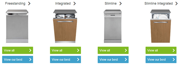
1. Top 5 lists are available in all product categories.
AO.com have simplified the user journey in the research stage by offering their ‘Best Products’ for each category. This helps users to cut down their research time in finding the best products; by focusing them on the top 5 products selected as the best value for money.

These are available from the product category page, where users are given the choice to ‘View range’ or to ‘View our best’. This supports the differing needs of customers where some will want to do their own research, and others will want a simple choice.
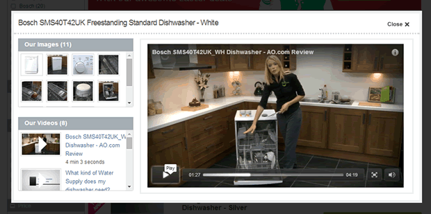
2. In depth product images and videos are used to combat the in-store experience.
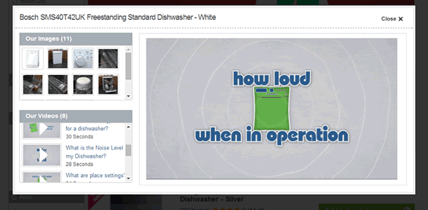
To help combat user’s desire for seeing the product ‘in the flesh’, AO.com offer videos and plenty of images. Each product page offers a variety of images at different angles as well as close up shots on rollover. Where the site really delivers is with their video reviews.
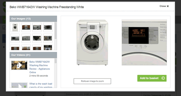
Most products have a video demonstration with a member of staff explaining the product’s features and benefits as if in the store.
There are often additional videos allowing users to answer common questions they may have about the product, which they can’t typically answer on a website very easily. In the dishwasher example below, there is a video explaining how loud the dishwasher is in normal operation:
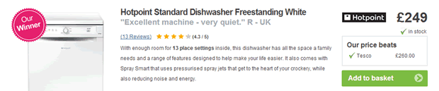
3. Each product page has easy to scan ratings and reviews.
Another core part of the AO.com user experience is the reviews and ratings other customers have provided. Most products have an impressive number of reviews which can be extremely helpful in allowing users to understand whether the product will meet their requirements or not. The sheer number of reviews on the site is enough to build instant credibility and offer users a thorough examination of the product they are considering.
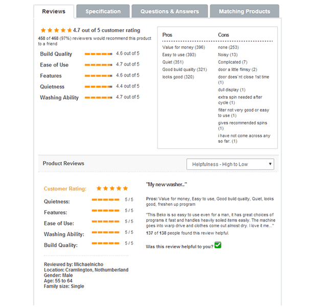
Reviews are also accompanied by useful ratings on the key areas users will be concerned about for each type of product; i.e. quietness, washing ability and build quality. This provides a huge advantage over the in-store experience and allows users to gain confidence in the product they wish to purchase.
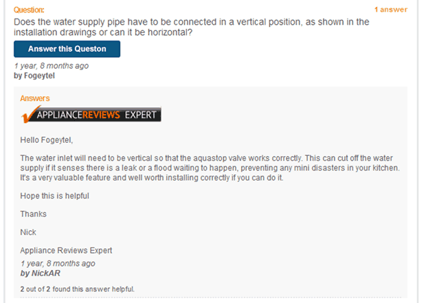
4. The AO.com team invest time in the ‘Questions & Answers’ section.
Another tactic AO.com use is to ensure customer questions are showcased on the product page. Using a tabbed system, each product page contains a ‘Question & Answers’ tab which lists customer questions about the product. The AO.com team pay attention to each question and take the time to answer as many as possible.
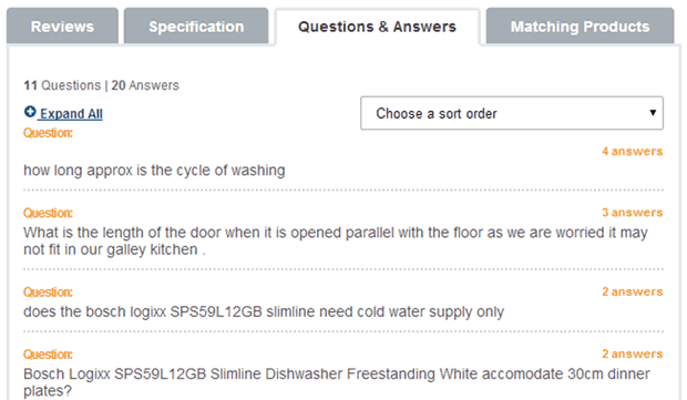
In our user research we found users will often have a question about a product which is not answered in the product information published on the site. Typically these questions can become a sticking point in the purchase decision process. AO.com have recognised this and make an effort to answer as many as possible.
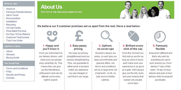
5. USPs are reinforced throughout the user journey.
Above the main navigation, AO.com displays 5 key reasons why users should purchase through them.
In addition, within the product pages AO.com show how they are cheaper than their competitors, which helps to reinforce that they are in the best place for a good deal.
If users are still not convinced and want to know more about the company. The about page further reinforces the reason to choose AO.com over the competition.
6. Streamlined checkout process with easy delivery slot choice.
To make sure users convert once they have made a purchase decision, AO.com have focused on streamlining the checkout process, to allow users to progress through the checkout without having to register or sign in. In addition, the one page checkout helps focus users on the step they are on, before the next step is revealed.
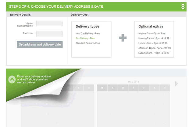
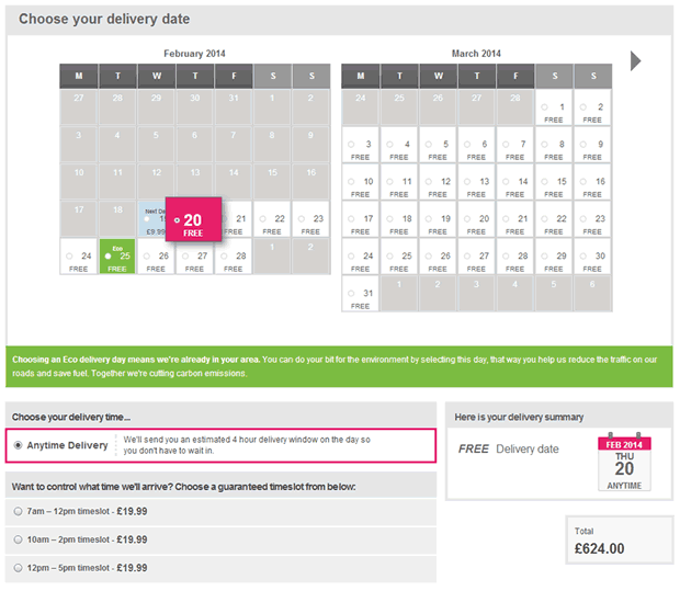
One of the common issues we found in user research is frustration with having to juggle vague delivery slots with work and school commitments. To combat this, AO.com gives users control over their delivery dates and time slots in an easy to use calendar system. There is also a nice system to balance business goals (to save delivery costs) with user goals (to be more environmentally friendly) by showing users the date when a delivery lorry is already in their area.
In summary.
Offering a great customer experience is not something that happens by accident. AO.com have clearly worked very hard to listen to user needs and frustrations and have successfully overcome most of them on the website. Their huge increase in sales and conversions seems to be down to prioritising their customer’s needs and ensuring any barriers to conversion are removed through rigorous user research.
Key takeaways.
- Improving conversions requires a dedicated strategy for ongoing user centred design.
- Identifying the reasons why potential customers leave the site and providing better support to help them make a purchase decision is the key to conversion improvement.
- Videos and imagery can be used to combat the need for seeing the product in-store.
- Providing mechanisms to answer common customer questions on the website gives them confidence in making a purchase decision.
- Emphasising the brand proposition throughout the site is critical in building credibility over competitors.
Need advice on how to improve your online conversions? Get in touch and see how we can help you.
