This was one research question posed in a recent client brief. Partnering with a disruptive start-up, we valued their aspiration to provide a ‘refreshingly different’ experience. Yet, what does that feel like for a user? Cue much discussion and thinking between ourselves and our client team, as we observed research participants experiencing this ‘refreshingly different’ experience through a prototype.
Alongside this project, together with my spouse, we had been increasingly tempted to breaking ties with high street banking and go all-in with one of the new digital-only banks. It had been several years since I’d had cause to walk into a branch of the high street bank we had been customers of for 15 years. I can’t even recall the last time I spoke to them on the phone. I had begun to feel disgruntled by the monthly £10 fee I was paying for my ‘Advance’ account. Its app and online banking experience could be politely described as functional.
A Better Way?
I must note, the following thoughts will show that I’ve become a fan of Starling Bank, who are not a client of Experience UX. In sharing these thoughts, I intend to outline what surfaced during our research combined with what I find refreshingly different about Starling Bank. This naturally leads me to rave about the different features and functions I value.
Too Simple?
‘Is it too simple?’, was a common question that surfaced throughout our research project. And this chimed with the feeling I had with Starling. One evening, once my spouse and I had finalised the decision and already set up our joint account, I went ahead and tapped the ‘Switch to Starling’ button in the app. I do not exaggerate when I say that within five minutes, I had completed the process and that I didn’t need to lift a further finger: in seven days, the switch would be complete.
The interface of the app is intuitive, and I can quickly see how it will work hard for us by categorising our spends, making us more aware of our spending habits. I set up ‘spaces’ to create savings goals or assign money to car maintenance, without the need to create separate accounts.
Our physical debit cards arrived in the post, made from recycled plastic – tick. I open the app to activate the card and it’s a few taps and away. I must say, there is one point here where the app left me initially confused:
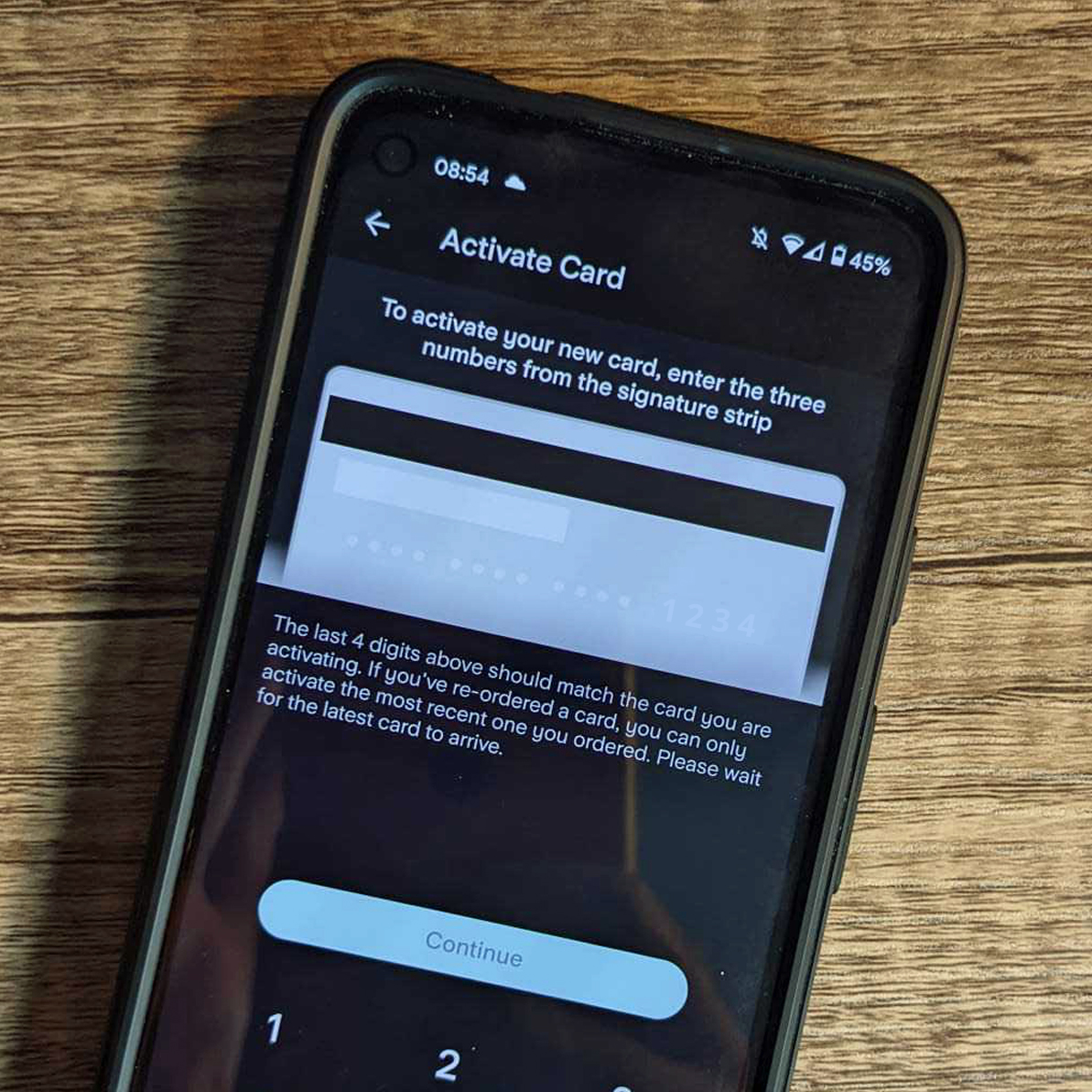
This screen asks me to enter the last three digits on the signature strip but shows me an image of the long card number and references this in the copy. Should I enter the last three digits of my long card number or those on my signature strip? My wife was caught out at the same point. One to work on, Starling.
For a £2 monthly fee, I create a space for each of our children which provides them with their own bank card. Teaching the value of money to our children, when we so rarely have change in our pockets is something we’ve been wrestling with, yet now I can automate their digital pocket money and provide them with a space for their birthday money, and a card of their own they can manage. This is all with the security of being able to set a spending limit, activate or deactivate their card at the toggle of a button and beck and call of an API.
I receive a personalised communication from Starling’s CEO (I have no idea of the name of my former bank’s CEO) explaining that while the contactless limit is about to increase to £100, they are responding quickly to customers’ concerns by updating their app to allow me to reduce my contactless limit or turn it off, should I choose. ‘At Starling, we want our customers to be in control of their money’ writes the blog post. Some brick-and-mortar banks do respond similarly, yet I don’t hear as much as a whisper from my former bank.
Make or Break
One to note: my live chat experience with Startling has been hit and miss. Interestingly, the availability of live chat was well-received during our research, and we sensed that it would make and break a customer’s experience. Research participants frequently stated a preference for live chat over telephone support as they would complete other tasks whilst waiting for responses.
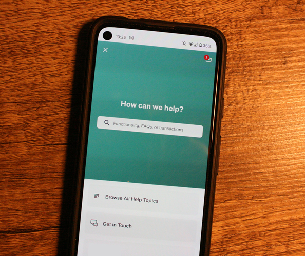
Starling’s live chat support is available 24/7 – neat. I had a question that I couldn’t answer with the initial FAQs I was presented with, so opened live chat. I was told there was a 15-minute wait time, so put my phone down and completed some other task. Later, I pick up my phone to find that my question had been responded to and answered – tick. However, because I had not responded promptly, the agent’s outro left me feeling at fault for not responding to them promptly… yet they weren’t ready to respond when I was in my moment of need…
To be fair, when I had further need to access live chat, I was informed there was a 1 minute wait time after which my query was promptly resolved.
How are their ethical credentials?
‘How are their ethical credentials?’ wisely asks my spouse when considering the switch. Without much consideration, my response is “No doubt, good. They’re new-tech, aware of consumer demand for ethical behaviour.” After six months of consideration and much reading of reviews, I trusted them at an intuitive level. I google ‘Starling ethical credentials’ and I like what I learn. They’re conscious about the environment, as I noted when my bank card arrived. They invest in their staff and have an inclusive, compassionate and transparent culture, as confirmed by Glassdoor.
There are ‘no hidden or rip-off fees’, care for vulnerable customers particularly when issuing loans, and they ‘ensure their customer base is heard’, as I saw through the contactless spend change. They don’t accept investment from the tobacco or arms manufacturers – tick. But what really interested me was their emphasis on tech for good, and that they will ‘Be alert to the social, economic and environmental impacts of our technology’.
They are watchful for customers at risk of being taken advantage of – when setting up some regular payments the app asked me to confirm that no one was encouraging me to set up the payment. The app indicated there were levels of automated and human checking of the payment: it’s wonderful to see a brand not just saying they take care of vulnerable customers, but putting those words into action through responsible tech.
Of course, many fintech companies will market these same principles. And perhaps I’m overly trusting or naïve… but I do believe it and feel refreshingly differently about them compared to brick-and-mortar banks.
The Feeling
So, as we often ask at Experience UX, what’s your intuition telling you? Why does this feel like a refreshingly different user experience? Perhaps it’s the geek in me, but I find that today, I’m strangely excited about opening my Starling app. I’m eager to set up my saving spaces and to teach my kids how to manage their money digitally. I look forward to delving into my spending analysis at the tap of a few buttons (strange, I know), providing me with feedback I have simply have never received from my former bank.
And yes, I might be in the honeymoon phase. But I sense no BS; that they’re for me and that I trust them. It does feel different… refreshingly different. Yes, it’s simple, but why can’t fintech products be refreshingly simple and intuitive?
So, in summary, and based both on our research project and my personal experience, what makes a refreshingly different consumer fintech experience?
- Simplicity: Yes, it really is this simple. In the words of one participant, ‘Is that it? Have I given them everything they need [to complete the process]?’ Assure users that refreshingly different need not also equate to ‘questionably simple’.
- Trust and transparency: Consumers rightly demand an honest, decent, and upfront experience. ‘Transparency’ was the word frequently used by research participants. Hidden fees or extra costs clearly do not equate to refreshingly different.
- Instant access: Tap and go is the on-demand, instantaneous and prompt experience we have come to expect. More flexibility, more control; fast and seamlessness service at the tap of a button.
- Digital-first: Stating the obvious, the digital-first interface must be more intuitive and helpful for the user than their existing experience. Show users how features and functions help them complete a task with greater consciousness, awareness and choice.
Ultimately, bombarded by every next-best thing in our social feeds, today’s savvy consumers sus what’s ‘legit’ and WIIFM (what’s in it for me?) in an instant. They expect more; demand more and will naturally choose those experiences that offer a truly refreshingly different experience.
Successful fintech brands are those that respond through the timely evolution of their products and services.
