As Ecommerce Analytics Manager at The Body Shop, Aimée Hart had plenty of black and white data about their mobile site, yet no real insight into how customers were actually using it. To discover more about the customer online journey, we worked with The Body Shop on two projects: a usability test of the mobile site and a follow-up navigation redesign project. Here, we talk to Aimée about how UX research can go beyond the data to give an insight into the voice of the customer.
“We wanted to validate assumptions and remove the guesswork by developing a user-centred roadmap”
What were you hoping to gain from working with an external UX team?
There has been a lot of talk about the ‘mobile moment’ where the amount of traffic on mobiles exceeded that on desktops. We reached that point in 2014, yet when I was reporting back I didn’t have much of a story. Mobile is really critical to understand because it is the one multichannel lever that people have with them all the time.
I had black and white data, but beyond basic behavioural and transactional data, it didn’t give me enough insight to answer questions about what people were doing on our mobile site. Are they just going on to the mobile site and then going into store? I had no idea. It highlighted that we needed to start promoting a Test & Learn culture, something to give us an understanding of what value we are giving to the customer.
Our starting point for the mobile project was therefore the need to understand our customer better, the conversion funnels and the pain points. It was about understanding the full journey and how the ‘why’ complements the ‘what’ of analytics. What are the users’ buying decisions? How can we optimise their purchasing journey? It felt like we were still far from really nailing down an ROI from someone who has researched online and purchased in store, or why our mobile conversion rate wasn’t increasing in line with traffic.
We wanted to validate assumptions and remove the guesswork by developing a user-centred roadmap. We had to understand why conversion wasn’t improving, but equally how does mobile feed into overall brand experience? We knew that customers had particular sticking points with the site, but what does that mean in the whole universe of different journeys that are undertaken on mobile? Or how do we reduce noise from internal opinions over what should or shouldn’t feature on the site.
To answer these questions, the best thing is to go to the voice of the customer and find out for ourselves. UX and, in particular, usability testing is the most straightforward approach in my view.
“The insights we got – those little golden nuggets which we didn’t expect – were really empowering.”
What did you want to focus on in UX testing?
We had our objectives and the buy-in but what was missing initially was a UX specialist to help us move forward. As we’d not worked with a UX agency before I had a few conversations with contacts and different companies in the marketplace. CRO is a new journey for us so we needed to keep an open mind about the tools and different suppliers that could give us the insight into the voice of the customer. Experience UX stood out because of its structured approach and the clarity around the deliverables at each stage.
We launched the usability project with five people. I was comfortable that if three people out of five said there was the same issue then clearly it wasn’t just a one-off. Obviously if we’d wanted more depth and granularity we might have used more people, but at this point it was top line. It was an entry mark understanding that we needed as we were at a place where we had absolutely no visibility.
Navigation was high priority – it was a pain point and an area of weakness. When people can’t find what they are looking for it is very easy to lose them. We had such valuable insights from the initial usability project, I knew that if we wanted to tackle navigation then Experience UX were the ideal partners to undertake the second part of the project. We had to get it right and it was clear that it would benefit more from a UX approach than an internal-centric way of describing things that didn’t resonate with the customer.
It was an exercise around our current navigation taxonomy. To benchmark it we had four different steps: the initial findability test, an open card sort, a closed card sort and then the final findability test. Having a findability test at the beginning and the end gave us a feedback loop; it really highlighted which products were causing ambiguity. We have quite product-specific naming conventions based on what we internally think we understand, but they are not necessarily obvious to the customer.
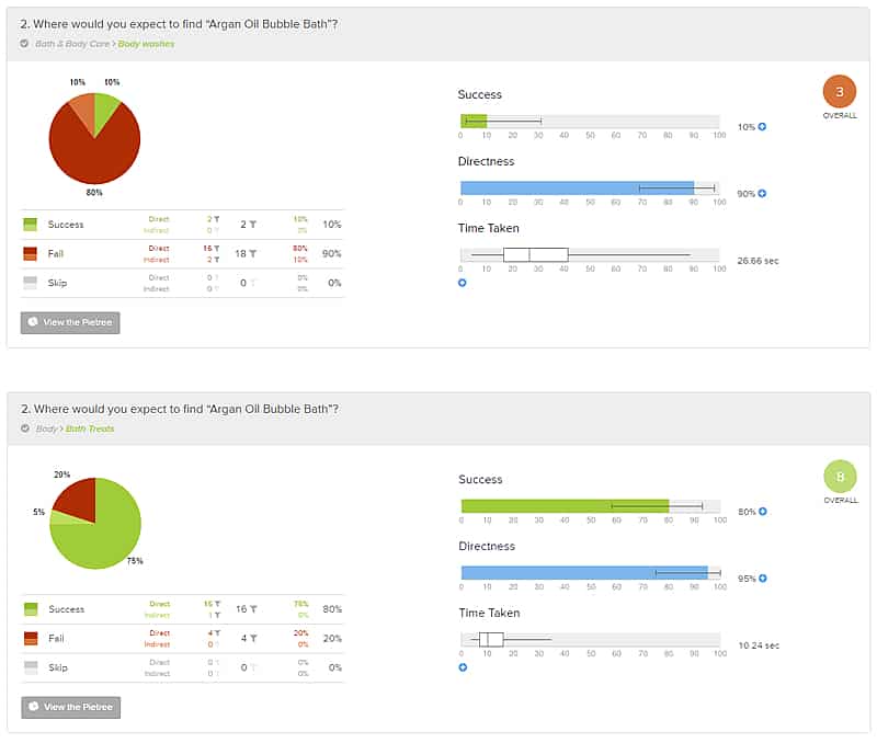 Findability test – task results before (top) and after (bottom)
“We knew that we had to get it right and that it would benefit more from a UX approach than an internal-centric way of describing things that didn’t resonate with the customer.”
What did you learn from the research?
The golden nugget we got was that skincare was not a massively searched term in Google and that people didn’t seem to categorise by skincare – they went straight to body type. This was one of the key insights we took from the project that helped us rethink how we structure things.
One of our strategic goals last year and ongoing was to build and be known as a brand for our skincare products. A lot of equity had built up around skincare-derived search terms and changing the site taxonomy had been considered to have quite an impact to our organic traffic. People were unsure about removing ‘skincare’ from the navigation and I had to convince them that it was the right way to go. We’re very passionate at The Body Shop, and I was able to influence the naysayers when having these conversations around change, as I have the customer insight to provide very compelling arguments, albeit just from the UX perspective.
With Experience UX’s methodical approach it was clear what we were doing every step of the way. It also meant that I could be methodical and really engage colleagues and our SEO agency upfront. I knew where the involvement was from each side and what was expected of me as the project developed from UX into a broader piece on changing the site structure itself and reviewing a lot of our keyword search tactics. It was clear how quickly each UX stage would be turned around and what we would get from each of the areas. With such a large product portfolio it could’ve been easy to go off on a tangent but realigning to the UX insight and the key objectives was crucial.
“… without that insight we would have been debating endlessly as to what the new structure would look like”
Now both projects are complete and live, what are the results like?
We agreed key KPIs for the SEO agency to monitor before and after the navigation launch. We saw positive uplifts across all categories both from an SEO perspective and across all site traffic.
The insight told us that people were categorising by body type. That was a huge thing for us because without that we would have been debating endlessly as to what the new structure would look like. ‘Skincare’ was rebranded as ‘face’ and we also introduced ‘skin advice’ as a section – that was where saw the biggest uplift. This proves how beneficial the work undertaken with Experience UX and our close engagement with the SEO agency were.
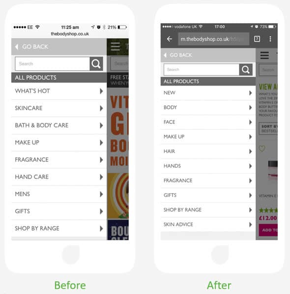 Mobile site navigation before and after
Overall, our migration in terms of site-wide traffic and revenue was hugely positive. We kept the site stable and the bottom line positive and the keyword ranking search volume didn’t drop off – all these validated our success. The navigational information architecture feels so much cleaner and eye-catching now, and meaningful as they are less cluttered or wordy.
The feedback I had when talking about the project to the wider L’Oreal was hugely positive. The structure and the approach undertaken in the work translated really well. This gave us a pivotal point to launch our own Test & Learn culture and best practise across the group.
“It was so much more than I thought we’d get when I think back to initially considering some online session replay tools”
What are the biggest positive learning points you’ll take away from the projects?
I think it was the breadth and the depth of the feedback. It was so much more than I thought we’d get when I think back to initially considering some online session replay tools. Some of it we were mindful of but never had anything to validate our guesswork and assumptions. The insights we got – those little golden nuggets which we didn’t expect – were really empowering.
I also learnt that you need to be prepared for the conversations that arise when you feed a UX project into the wider team. An example are the arguments about the balance between UX and SEO. UX gives you a voice and empowers you but it doesn’t end the conversation.
It really helped that Experience UX are approachable, open-minded and make recommendations that are well-founded and not fluffy or too restrictive. There was always an open dialogue, even if you suggest something wacky. It’s great to have someone mediating when there are conflicting views and helping to resolve those views objectively rather than subjectively.
The research opened up gaps in the marketplace we hadn’t considered. In theory, SEO agents or competitive intelligence insights should’ve advised of skin advice being a missed opportunity. In fact, it was following the UX work that we were able to challenge our partners by saying: “You know what? We want to offer skin advice. What is the opportunity?”
If I did another project, I would bring in more people at the very start – I would have liked more people to see what we saw. UX needs a bigger voice in our Test & Learn culture and group as a whole. As we progress and mature hopefully that voice will get bigger and more people will understand and be curious as to what it can offer us.
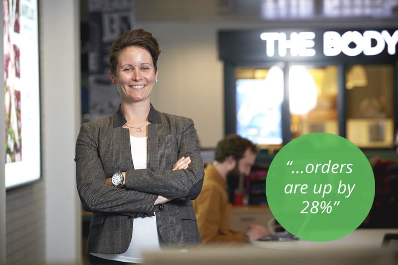
“… early statistics were very positive, with year on year orders up by 28%”
Project Overview – Oli Gitsham, Head of UX, Experience UX
This was a really nice project to work on and it was all about mobile. We ran the usability tests in London with the client project team coming along to watch and, following the research, we presented 34 recommendations to The Body Shop. When the team left the usability testing session they had seen the issues, but they didn’t necessarily know what changes to make to the site. Our report replicated all the issues and then said, “Here’s how to solve all those problems.” – We had lots of nods and “Yes, we saw that too” when we delivered our findings and recommendations.
One of the big usability issues regarded the Navigation Structure and Aimée asked how we could help to improve the taxonomy of the mobile website. We designed a four-step process, including card sorting and findability testing, that involved users throughout. The project became more collaborative at that point and deliverables became less formal. Our team was able to spend their time focused on UX work, with a quick deliverable, then on to the next method. The project flowed really well.
Soon after the project we heard from Aimée that early statistics were very positive, with year on year orders up by 28%. So overall this was a fantastic project that included various UX methodologies and, ultimately, a successful outcome for The Body Shop and their users.
————
Thanks for reading. If you would like to talk to us about this project and the methods we executed please contact us.
