Stop driving your customers crazy by forcing them to fill in endless forms before they’ve had a chance to decide what they need. As a financial services provider, if you are doing this it’s likely you are missing out on conversions. Why? Because customers don’t always understand which product they need, there are often complex concepts they need to digest in order to make a decision and they are being bombarded with difficult questions that they hadn’t even considered!
10 years ago, if you needed insurance or a personal loan, you’d get advice from a professional (a broker, or a bank manager). They would explain the options and present you with an option to suit your needs. Today, you’re more likely to head straight to the internet. The first thing you’ll face is a form to fill in to get a quote. No one cares about what you want, what your needs are, instead you have to complete endless online forms asking everything from your first childhood memory to your shoe size.
If your customers can’t quickly access the information they want, they will leave your website and head straight to one of your competitors who allows them to get a quick, pain-free answer.
Here are 3 simple ways you can stop driving your customer crazy when getting an online quote and ensure you don’t miss out on those much needed conversions.
1. Help your customers choose the right option
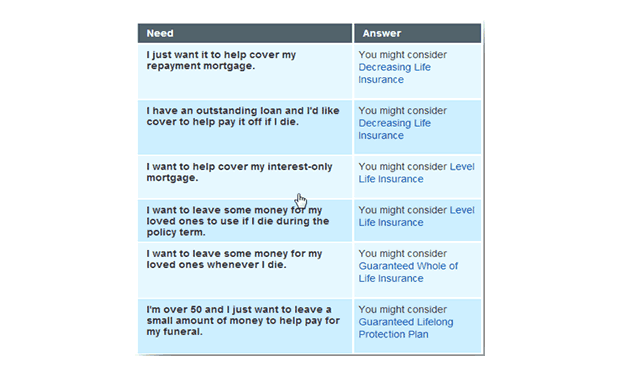
When people arrive at your website, they come with a problem. ”What happens to my mortgage if I die?” “What happens if my house is set on fire?” That problem should be the most important part of the user journey. Yet often this problem isn’t even acknowledged on quote pages and companies make the mistake of focusing on their products such as life cover or contents insurance.
If you are doing this, then stop doing it right now! Your customers don’t know what your products are! They just want life insurance they don’t know the difference between ‘Elite Life’ and ‘Level Life’ so stop making it so hard for them. What’s more, if your customers have to hunt around for the right content they also run the risk of getting the wrong product. Not good for their user experience and not good for your customer support team later on.
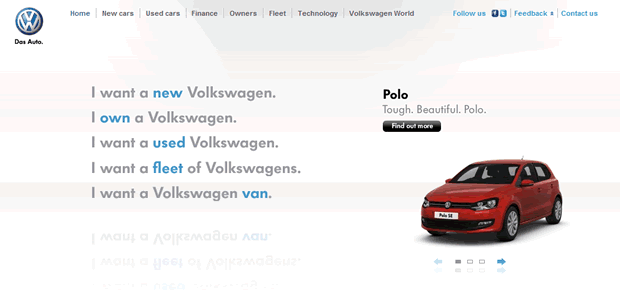
By offering a “help me choose” option you can easily help your customers match their requirements to your products. Alternatively, help users with clearly signposted user journeys tailored to the problems they are trying to solve. Although not a financial services example, VW provide a useful example where users are offered a series of statements which help them quickly select the correct section of the website. Customers are still able to access the traditional navigation if they prefer.
Aviva also offer a task based approach to help their users navigate to the right product. By keeping things simple they are much more likely to ensure their customers end up in the right place with a price for the product they need.
2. Create engaging content to explain complex terminology
There’s no escaping the fact that as a financial services website you are going to have to go into detail about some of the more difficult and complex concepts of your products and services. There’s also no escaping the fact that for a user, this is going to be pretty boring and an unnecessary barrier to completing their goal.
Most websites expect their customers to diligently read through all of this information but how many of your customers actually do? This can then result in them purchasing the wrong product or put extra strain on your customer service teams later on if they haven’t fully understood what they signed up for.
To combat this problem, why not try and create more engaging content to educate your customers? A great example of a company doing this is Wonga.com. They use a short video (under 3 minutes long) to explain how APR on their website works. They break it down using examples and simple language so that people can quickly understand the information they need to proceed with a loan without getting bogged down in lengthy pages of text.
3. Stop asking for personal details too soon
Of course it’s important for you to get personal details as soon as possible, but customers are more likely to leave your site when you do this and head straight to one of your competitors who don’t force them to provide this information.
So how do you make sure you still get this information? Be bold! Give your customers a quote without them having to enter their personal details. This might sound terrifying, but there are other ways of capturing that crucial data. Provide your customers with further options such as receiving an email with their quote information or having the option to save their quote online.
By doing this you’ll have happy customers who are much more likely to enter their details in exchange for something valuable to them. You could even offer further incentives such as fixing the quote price for a limited time.
Key Takeaways
1. Think from your customer’s point of view and try and solve their problem rather than simply focusing on the products or services you offer.
2. Don’t be afraid to be innovative in your content creation. It’s worth investing in this area in order to ensure your customers really understand those complex concepts and terminology.
3. Be bold and give away your information with no strings attached. This might seem like throwing away good information but in fact you’ll improve your dropout rate on your quote pages by being brave.
Want to know more?
We are experts in usability and have worked with many financial services companies to help them improve the online experience of their users including LV, Churchill and UIA Insurance. If you want to find out how we can help your business then get in touch for an informal chat.
