We noticed yesterday that the new Marks & Spencer website redesign went live. Here’s a quick summary of the changes we felt were most interesting. More research would be needed for us to give a thorough UX opinion but our first thoughts are that it’s a positive redesign.
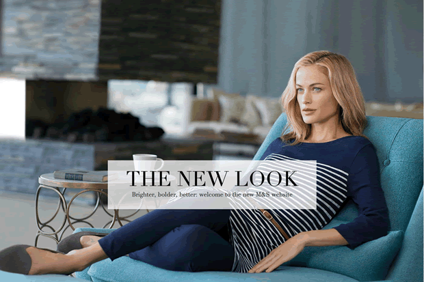
In this article, we highlight the 21 UX improvements made to the new Marks & Spencer website and why we like them.
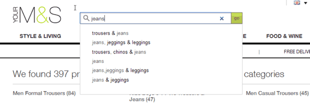
1. Search is a more prominent feature
The site search is placed in a more prominent but unconventional position next to the logo in the top left. Interacting with the search expands the search box and introduces ‘type ahead’ functionality to speed up the search process for users. M&S have made more of the search feature and want showcase this by making it more visible in the top left as opposed to the more conventional top right or centre placement.
2. Simplified mega-dropdown navigation
M&S have separated the dropdown menu into two stages for users. Instead of showing a larger list of navigational choices in the dropdown, they have introduced an extra step which makes for a simplified choice of subcategories. This allows for a simpler list of options to choose from in the lower levels of the information architecture.
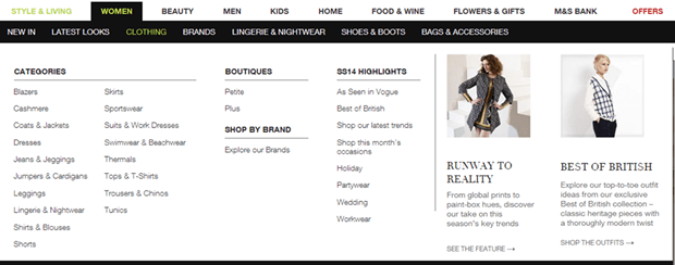
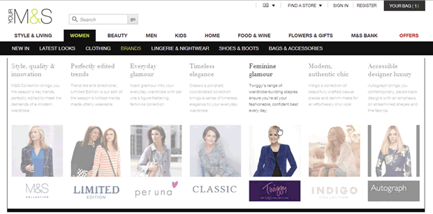
3. The layout of each mega-dropdown menu is tailored to suit the content
The mega-dropdown menu shows a variety of different layouts depending on the content displayed. These different layouts work well and make the navigation more engaging, while still providing a good balance between finding products and providing inspiration.
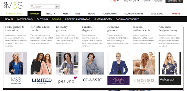
4. Subtle design effects help users focus on navigation choices
The attention to detail on the site is impressive. When moving the mouse over the mega-dropdown each individual navigation choice is highlighted while the others options are slightly greyed-out; drawing attention to one selection at a time.
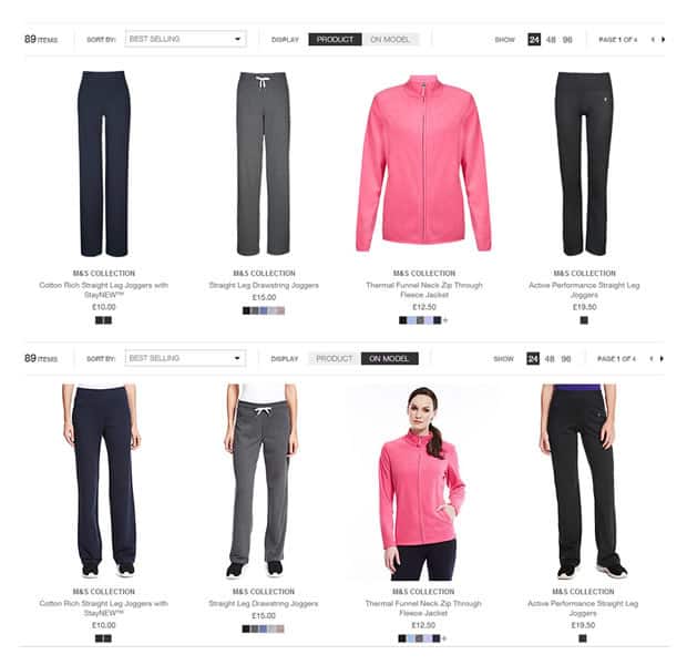
5. Users can choose how products are displayed
On listing pages, products are displayed isolated on a white background or in context on a model depending on which options users choose using the ‘product’ or ‘on model’ toggle. Although not a new idea, this is an interesting concept which allows users to see the product in its different views. From our previous research we found that users are split between wanting to see products in context and wanting to see products on its own. This solution serves both users well.
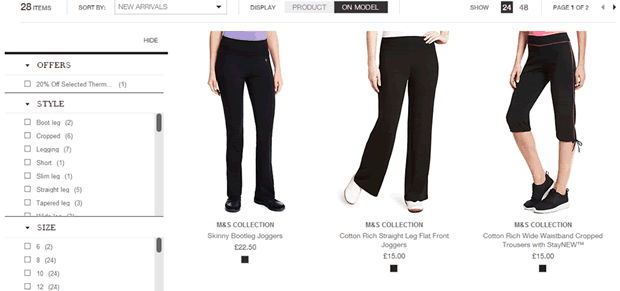
6. Users can filter products using a faceted navigation
M&S have opted for a faceted navigation similar to the one we’ve seen on ASOS for some time. From our own usability testing and research, we know this tests very well with users. The only issue on the M&S website is that it takes a long time for each change to load and making multiple selections can be tiresome.
7. Users can view products with a ‘quick look’ feature
A ‘quick look’ lightbox is provided which allows users to quickly review a product without having to leave the listing page. This is useful to save users from having to jump to different product pages when comparing products. Again this is not new functionality and we have seen this on many retail sites but M&S have made it quick and easy and implemented it well.
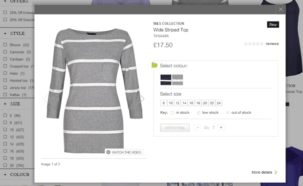
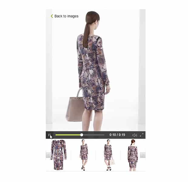
8. Good quality, large images with video content improve product pages
Most products have several large professional images on a white background and many include a video of the product. From previous usability testing with e-commerce websites, we found the quality of product images can have a significant effect on conversions and we anticipate M&S will benefit from these.
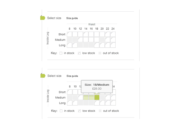
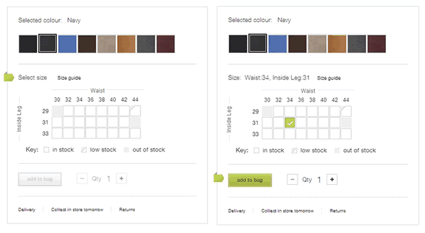
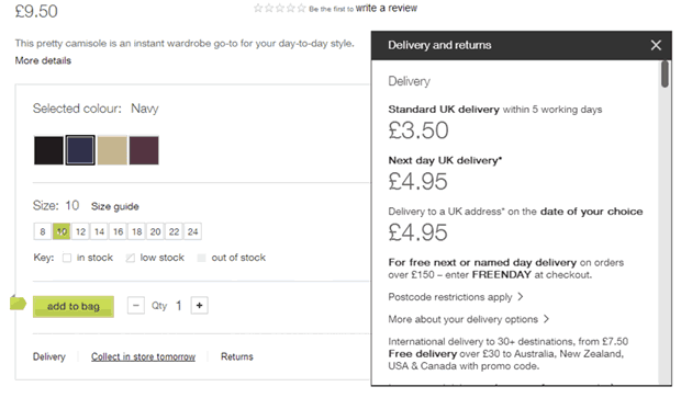
9. Useful visual size guide
When choosing the item size, a well-designed interactive size guide is provided. This gives users a quick view of stock items with more detail on roll over to help make a selection.
10. Progress indicators are used to avoid errors during purchasing
The product pages display a progress indicator that leads users through the key purchase decisions. The ‘add to bag’ button is only active when the preceding choices have been made avoiding the need for error messages.
11. Information on product pages is kept to a minimum
Product pages are minimalistic and make use of white space. This focuses user attention on the image and purchase decision. M&S provide links at the bottom of the page which when clicked show added contextual help. On other retail sites this information is displayed on the product page which can add more visual distraction.
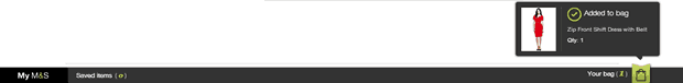
12. Persistent basket is visual at the top and bottom of the page
Clicking the ‘Add to bag’ button drops it down to a persistent basket bar at the bottom of the page. This is unconventional but works well. The more conventional basket is still accessible in the top right corner of the banner.
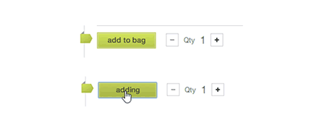
13. The ‘Add to bag’ button provides instant feedback when clicked
Clicking the ‘Add to bag’ button, instantly changes to ‘adding’ providing feedback that the button has been clicked. In our user research we’ve noticed users on slower connections can click a button more than once to add an item to the basket. This solution should avoid any confusion in a similar scenario.
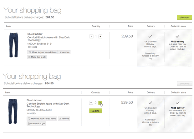
14. Updating the basket is designed to prevent user errors
The shopping bag is clear and well designed. M&S have opted for ‘+’ and ‘-‘ buttons to change the quantity . In its default state, the ‘update’ button is hidden and only appears when interacting with quantity controls (which greys out the checkout button removing the chance of errors).
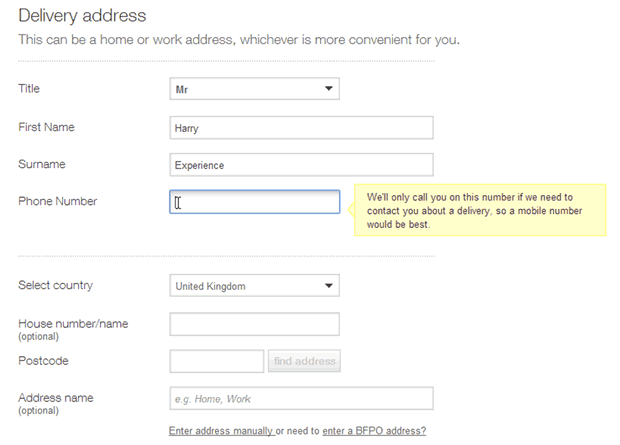
15. Simple form design in the checkout process
The checkout process is clear and easy to use. The labels and form fields are larger than normal and the page is free of clutter. Useful contextual help is provided as users move through the form.
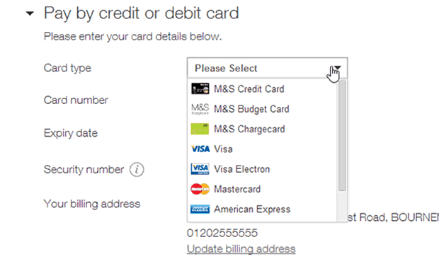
16. Credit card logos are used in the payment selection dropdown
The card type dropdown displays credit card logos which makes this list easier to scan, this is useful considering the variety of different payment choices available .
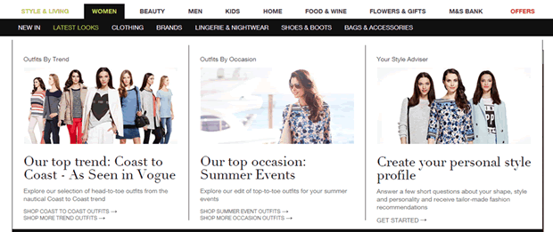
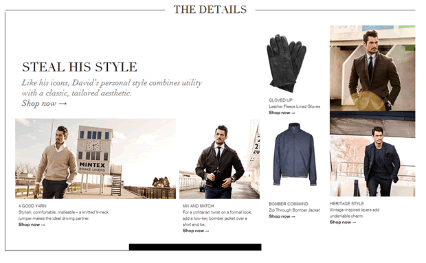
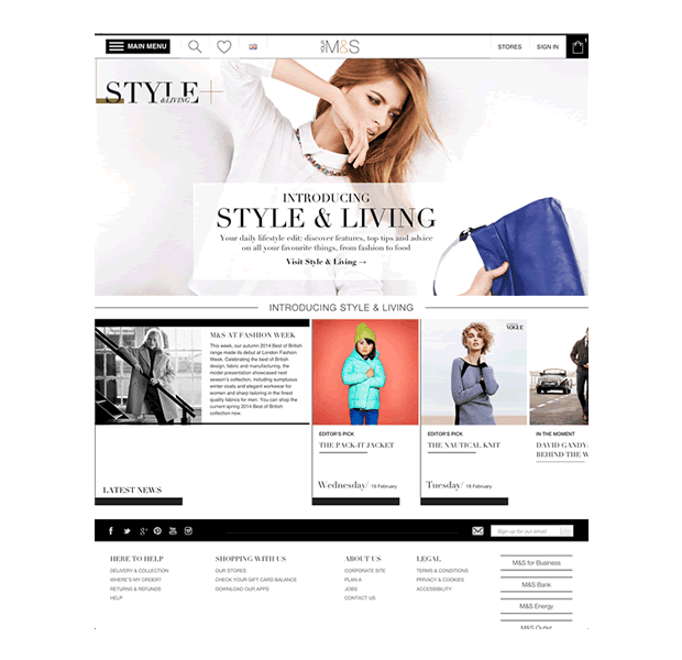
17. Inspirational editorial is used to enhance the ecommerce experience
Providing more inspirational content through the ‘Style and living’ magazine section makes the site more than just an e-commerce site. A nice feature here is the ability to read article and then “Steal the style”. This presents a listing page with all items related to the article that you can buy on the site.
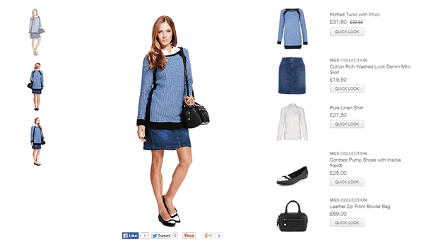
18. ‘Shop this outfit’ is available from the product page
Additional ‘Shop this outfit’ content is available from the product page, allowing users to see the entire look and purchase the individual items. This changes the way people typically use the Marks and Spencer’s website by inspiring additional purchases and is therefore likely to increase average basket value.
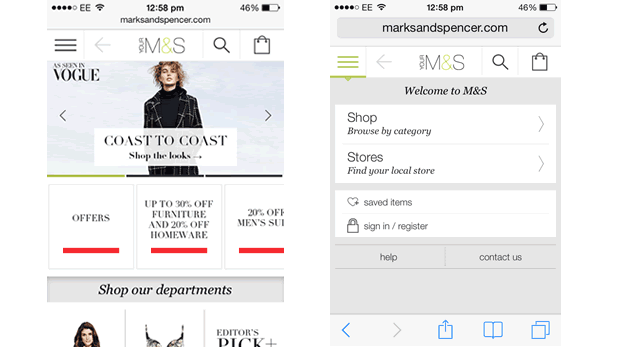
19. The site is designed individually for desktop, tablet and mobile
M&S haven’t just replicated their desktop website for tablet and mobile but have instead designed a separate website specifically for each device. This works well and ensures the site utilises the benefits of each device. In the example below we show the iPad version of the site which is very different from the phone and desktop versions.
20. M&S mobile website is conventional and works well
They have catered to the users’ mobile journey by providing a prominent search icon in the top navigation and also prominently display links to their stores.
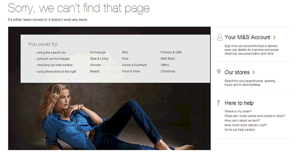
21. Well-designed 404 error page
With the launch of a new site it is likely there will be some hiccups with broken links. In anticipation M&S have designed a helpful 404 error page. This provides users with suggestions on how to recover and have replicated the navigation within the page.
Summary
The M&S redesign appears to have many good improvements to the user experience. However without further investigation and research, it is difficult to say how good the changes will be. As with any redesign, the site is likely to introduce some usability problems which will only be discovered through thorough usability testing over time.
If you would like us to review your e-commerce website, get in touch.