We reviewed more than 70 insurance quote and buy processes to determine what makes the best user experience (UX). We compiled a top 10 list of things to help you to improve your quote and buy process.
We reviewed over 70 insurance companies
We audited more than 70 insurance companies and brokerages both in the UK and internationally. We focussed solely on the quote and buy process to uncover what makes a poor UX, and what tips and tricks make the experience smooth and easy.
We then ran a series of usability tests with participants who had their insurance coming up for renewal and were actively looking for a new policy. The results, some expected, some surprising, are highlighted below.
1. Do not ask for personal details at the beginning of the quote process
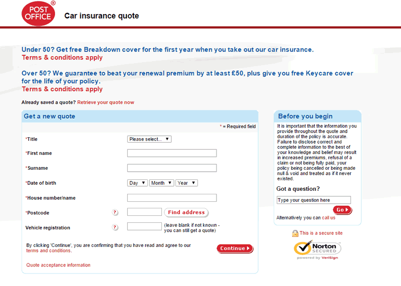
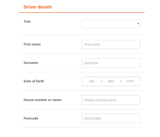
Some quotes start by asking users to enter all their personal contact details. Our user testing found that people immediately had concerns giving away their personal information. They were worried it would lead to unwarranted sales calls and spam emails. Some test participants said they would leave any site forcing them to enter personal information right at the start. The Post Office is one example that immediately asks for personal details, making plenty of users wary from the start.
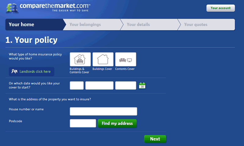
By comparison, we found that those sites asking for personal details later in the process tested more positively with users. CompareTheMarket.com is an example of a site that tested very well. Only a few participants even mentioned the site asking for personal information, and those that did felt that they had already invested enough time in the process for it to be warranted, thus making them less inclined to leave.
Our testing indicates that moving sections requesting personal details to later in the process is generally a good way to keep users invested and cultivate trust. A good alternative is to start the process with details about the area users are looking to get insured.
2. Improve the look and feel of your quote form
Of all the insurance quotes that we reviewed, those that were visually appealing (larger text fields, more white space and less clutter) were perceived as being much easier to use. These sites saw participants making far fewer mistakes when completing the forms and the average completion time was much lower. Hastings, shown below, came out on the lower end of that spectrum. Users mentioned that the radio buttons weren’t obvious, the font was quite small, and that the design makes the form look more complicated than it really is.
Bell Insurance, which is part of the Admiral Group, has redesigned its quote form with tremendous results. Even though the site asks the same questions, their clean look and easier interface tested well with potential customers, who had fewer problems getting a quote.
We saw users place a large emphasis on look and feel. It’s something we all like in any sort of interface – no one wants to attempt to figure something out and fail, even in the privacy of their own home. Failing to get the desired result can drive a user from a website forever. A simplified quote form can be worth more than any amount of copywriting or marketing collateral. For a better understanding of ‘perceived usability’ check out our post explaining it: The power of perceived usability – why good graphic design is essential
3. Make forms more engaging with icons and images
Let’s face it, getting an insurance quote online isn’t the highlight of most people’s day. Some of the sites we looked at made the experience worse with complex looking forms. Plain text on white backgrounds gets repetitive, and that was represented in the example below of The AA website. When there were no pictures, graphics, charts, or tables to break up content, we saw that users’ attention quickly started to wane and they soon began making simple errors as their attention lapsed.
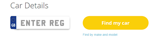
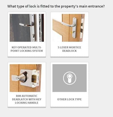
Simple bits of innovation can be a great benefit to keeping your users focused on the task at hand. Consider replacing the standard text fields with radio buttons and drop-down menus. Sites like eCar in the example below have made the registration field look like a license plate. Go Compare provide large boxes with images of door locks to make their forms more engaging.
By necessity and because of the rigorous hurdles they have to clear to be approved, most insurance quote forms are quite lengthy, but that doesn’t mean they have to be boring. These examples show how creative license can help keep users engaged, leading to fewer errors and a better user experience.
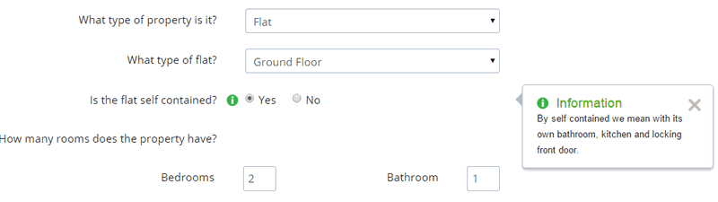
4. Reduce the number of available options in drop-down menus
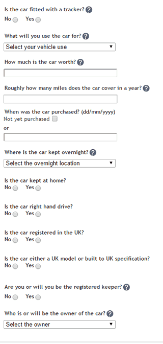
We expect drop-drown menus to be simple, with few enough choices that we can pick out the one that fits us best within a second or two. So imagine having to find your property type out of a staggering list of 42 choices, shown in The Green Insurance Company example below. To make things more challenging these options are not grouped together, “Above Second Floor Flat Conversion” appears at the top of the list but “Top Floor Flat Conversion” appears 39 places lower. This means users need to scan the entire list to find the most suitable option for them. On another insurance site we reviewed, it was possible to insure a castle and use “His Royal Highness” as a title.
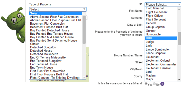
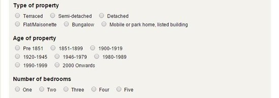
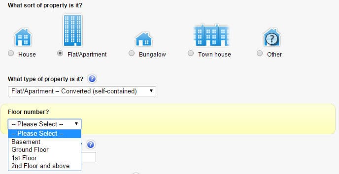
By limiting the number of responses available in drop downs and ordering them logically, your users will be able to quickly complete each question. Sometimes breaking down a single question into sub-questions will reduce the number of options available. In the example below from Money Supermarket, three separate questions are employed to understand what type of property you live in.
Rather than fewer questions with more options to choose from, our testing showed more questions with fewer options worked better and meant users can complete forms quicker with fewer errors.
5. Do not make assumptions
Most of the sites that we tested replaced a series of questions with a single page of text titled ‘Assumptions’. Although fewer questions are asked in the quote, users must read through a page of text before continuing with the form. Littlewoods, in the example below, uses a long, detailed Assumption page.
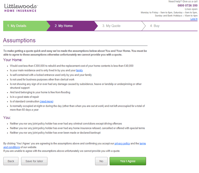
All of the participants tested felt this approach was more time consuming. We suggest refraining from using an “Assumption” page to reduce the number of questions in the quote form. The sites that tested well with users displayed each assumption as a question, but provided a default answer which allowed the users to scan the page before clicking ‘next’. This example is seen on the Admiral website below.
Our testing found that users take longer to digest the information if it’s presented as assumptions.
6. Provide tools and calculators to help users complete forms
Some questions required the user to complete some calculations. These could be simple questions such as ‘How many miles do you drive in a year?’ or more complicated ones such as ‘How much are all your home contents actually worth if you were to buy them today?’ or ‘How many units of alcohol you drink on average in a week?’
It can be really tricky to make these kinds of calculations in the middle of filling out a quote. To ensure that these questions do not form a barrier we recommend placing tools and calculators within the form to help users work out a ‘best guess’ so that the quote process can continue smoothly.
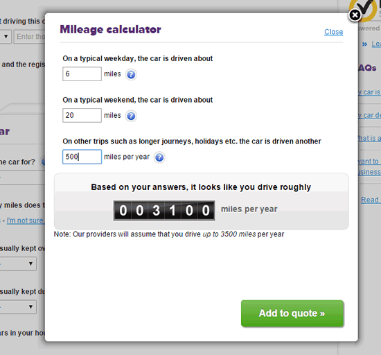
Online tools and calculators placed within the quote process help users get an accurate quote while providing them with confidence that they are fully covered. This will help to reduce the number of calls to the call centre or users abandoning to seek out answers to these questions.
7. Ensure help text is written for users (and not by the compliance team)
On some of the forms we reviewed, it felt like the help tool’s text was written by a solicitor to form part of a legally binding contract. When explaining the acceptable lock type for a door for example, one tool tip reads:
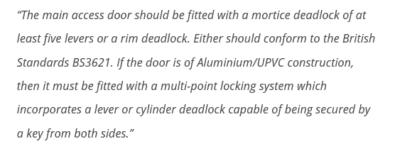
Users may need help at some stage when using your site. For this, they will normally turn to the help tool. It’s important that this help text has been written with your target user in mind. It should be concise, helpful, and well-written, free from technical and legal jargon. The help message is also a great opportunity to convey personality and warmth.
Help text is key way of reassuring users when they are confused. By removing any jargon and using a friendly tone of voice, users can recover from their issue and continue to purchase. Without it, they are more likely to abandon and go elsewhere.
8. Only ask relevant questions during the quote process
One of the things that frustrated nearly all participants was being asked questions that they thought irrelevant or unimportant when getting a quote. Questions added by the marketing team for example (e.g. How did you hear about us?) or when used in an attempt to cross sell other products (“Tell us when your car insurance is due”) irritated users and sometimes gave them negative feelings towards the insurer.
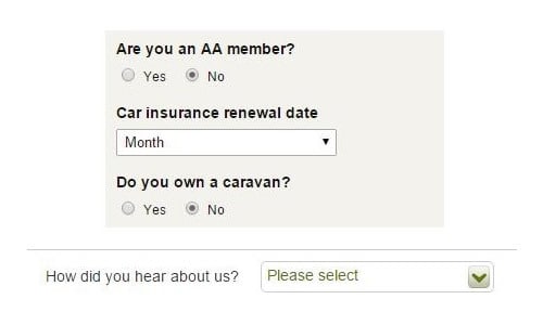
We recommend reviewing each question of the quote process. If the question is not required to get a quote, then consider removing it. If the question is deemed important to the business, consider asking it during the application process once the user has already committed to using your services.
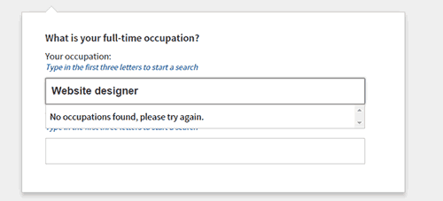
9. Make it easy to enter a job title and industry
One major issue that we saw on nearly every site we tested was the question asking users to enter their job title and industry. What we noticed was users tended to look at the keyboard when entering their job title into the text field. They did not notice the list of jobs presented to them in the drop-down menu, and by the time they looked up, they saw an error message saying their job was not found. The example below from Go Compare shows this problem.
One site that seems to solve this problem is ‘Google’s’ comparison website. It defaults to displaying the list of jobs automatically when clicking into the field. In this solution, users realise they are searching a specified list of job titles and therefore look at the screen as they type each letter.
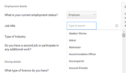
We liked this solution so much that we created a specific blog post for it: Is this common UX fail ruining your online form conversions?
10. Display a prominent free phone number and live chat service on all pages
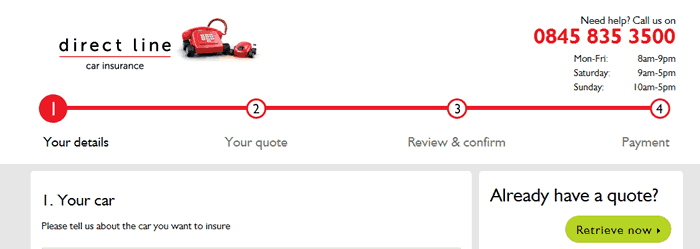
Some of the sites that we reviewed did not display a clear phone on the page. This lack of transparency put users off straight away and they would leave the site if there was not a real contact number provided. Users were also quick to point out those sites that had a number but it wasn’t free. They questioned why they should pay for the call when they are giving their business to an insurance company. Although Direct Line display a prominent number on its site, some users were put off that they needed to pay the call charges.
We recommend prominently displaying a free phone number and the opening hours for users to get in touch if they prefer to do so.
In Conclusion
There is a huge amount of competition in the market when it comes to getting an online insurance quote and very little to distinguish one company from the next. Although cost is the main reason for users to choose a provider, in our testing, we found users were very quickly put off when facing a long, arduous quote and buy process and had little tolerance for poor UX design. By implementing our recommended 10 improvements to your quote and buy process based on the evidence that we have seen from UX testing, you’ll be sure to stand out from the crowd which can only lead to better conversion rates and happier customers.
Need help with your insurance quote? Our Insurance UX experts would be happy to have a no obligation chat to see if we can help you – Get in Touch
