
We’ve learned whilst doing user research for our clients in the education sector that getting the user journey right for prospective students can be extremely challenging. Research participants have demonstrated that the process of finding an institution you want to study at, is highly subjective, and comes with a plethora of emotions and uncertainties. There are some issues that come up time and time again, and we’re going to share our top 5 ways to improve your student recruitment approach.
1. Ensure the course search caters to different stages of the research journey
Cast your mind back to your final year at college. Did you know exactly what you wanted to study at university? Or did you just have an idea of what kind of thing you were (and weren’t) interested in? We’ve seen in user research that those are two common mindsets of prospective students, and their online journeys can vary wildly depending on which stage they’re at.
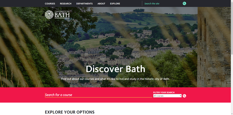
It may sound overly simple, but making sure users can quickly and easily search for courses on the website is a good starting point. The University of Bath features a prominent search field with the ability to filter courses by level of study e.g. Undergraduate.
Going one step further and using an intelligent type-ahead search functionality, like Nottingham Trent University, helps speed up the journey for those students that have a rough idea of what kind of course they want to study, e.g., Psychology.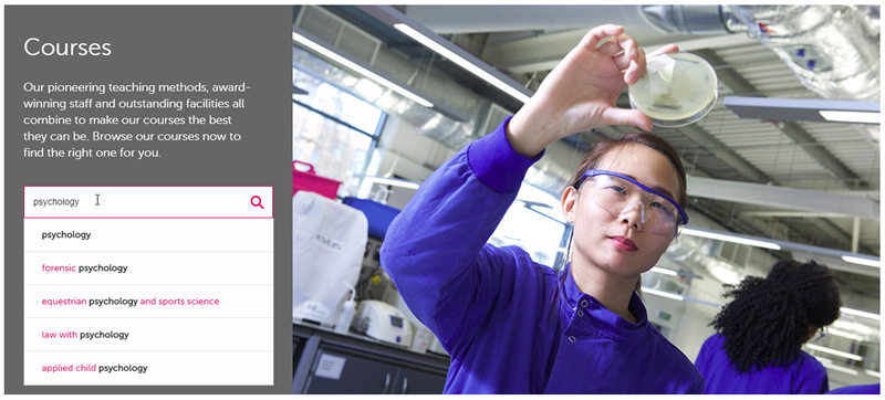
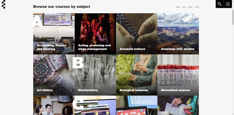
The University of Essex provides a clear link to subject areas, to help guide those that have a few potential topics in mind but not a specific course. Although their grid layout takes up more screen real estate than the typical list of text links, the imagery makes it a much more engaging use of space.
2. Use the course page to inspire
A common challenge we come across is ensuring the content is detailed enough to answer users’ questions, but not so heavy as to put them off from reading it.
Breaking up content into manageable chunks and presenting it in a way that makes the content easy to read might sound basic, but these are the foundations that you can build a truly delightful experience on. The University of Essex do this well;
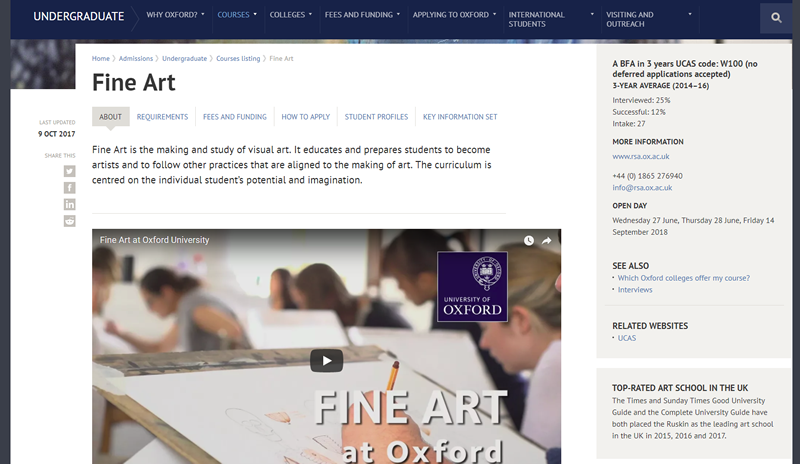
A video is a great way to minimise text on the page and replace it with a more engaging type of content. The University of Oxford leads its course page with a video that provides a detailed look at the course, along with perspectives from both students and their lecturers.
The UAL course pages feature photos of students’ work, a quote from a current student and a snippet of the courses’ Instagram feed. This will help users to get a real feel for what it’s like to study there.
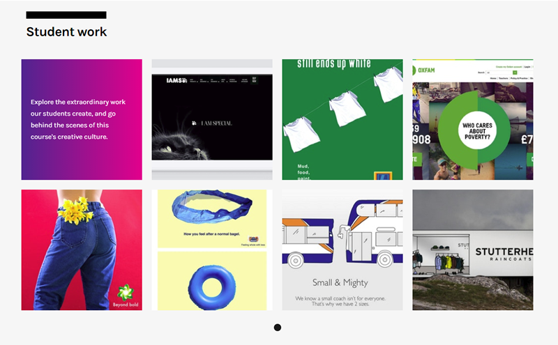
 University of the Creative Arts communicate what students should expect during the course by showcasing current students’ work.
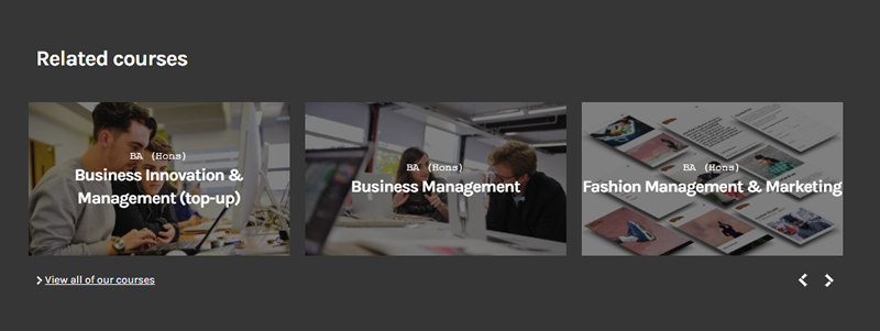
To avoid a frustrating dead-end journey for users that are in the early stages of browsing for a course, UCA also provides links to related courses at the bottom of the course pages to help continue the journey.
3. Provide a clear route to the next steps
After finding a course that’s of interest, there are a few natural next steps depending on what stage in the research journey the user is in;
- Find out more about finance options, accommodation and student life
- Order or download a prospectus
- Book an open day
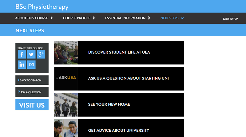
There are a few things you can do to ensure the journey to the next step is a smooth one. The University of East Anglia ends its course page with a series of links on what it’s really like to study at UEA. As well as the typical links to student life and accommodation there are also some subtle but reassuring links to advice about starting university.
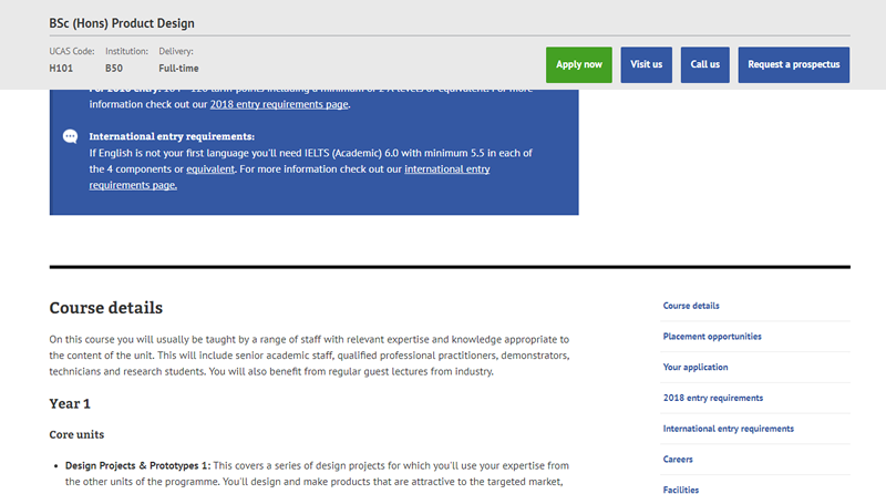
Bournemouth University uses a sticky header that follows users down the page, to provide a consistent set of links to the next steps; such as making contact or downloading a prospectus.
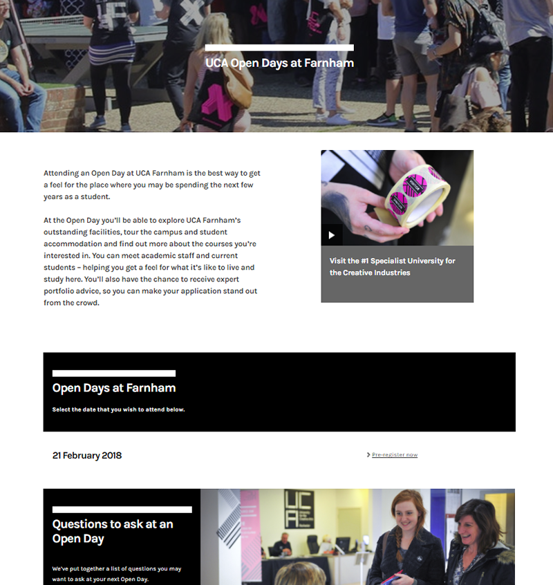
A compelling open day page is a good way to inform users on what to expect and encourage them to book their place. UCA go one step further and include a section on ‘questions to ask on an open day’, adding some reassurance for nervous students.
4. Tailor supporting content to larger emotional needs
Once a suitable course has been found, we’ve seen during research that the next step is to look for supporting information about other aspects. The cost of studying and financial support available is a consistent thread running through the prospective student journey, but there are some that are specific to the type of study.
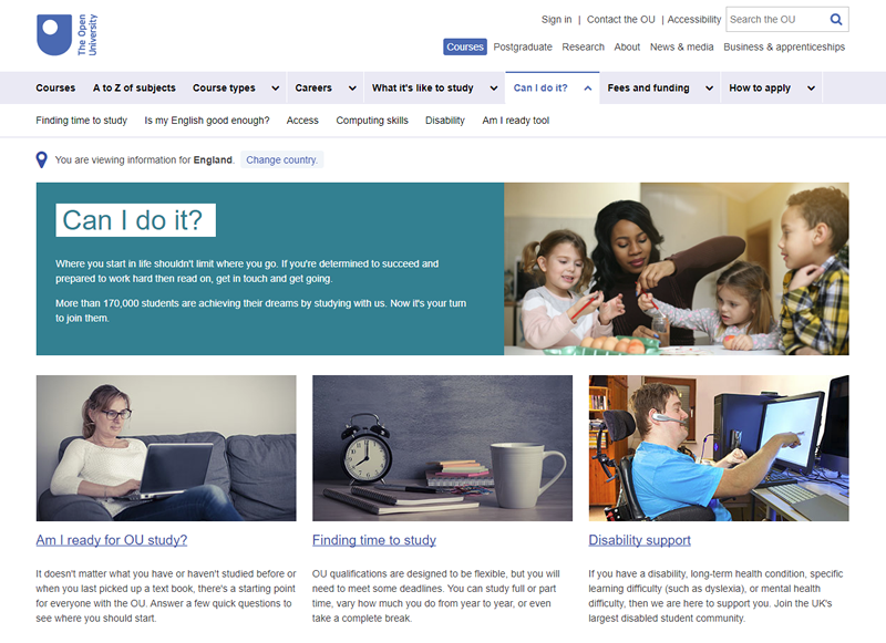
We toured the country carrying out user research for The Open University last summer and we found that distance learners had distinctly different needs to those looking to study full time on campus. They need to get a feel for what distance learning is like on a day-to-day basis, how they will actually learn and the level of support they will get. We spoke with people that had been out of study for some time, so reassurance about whether they can do the course was key. For those that are looking to move to the next stage in their career, by studying alongside a full-time job, understanding the time commitment needed was essential.
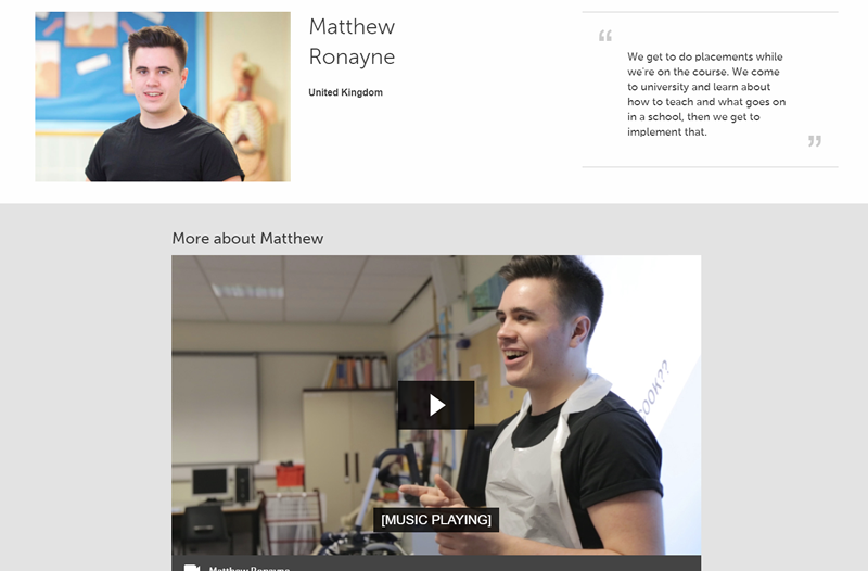
For college leavers, the move away from home for the first time to study for three years in a potentially unfamiliar place is a daunting one. For them, getting a gut feel for what student life is like both on campus and in the surrounding area, is critical to them feeling comfortable enough to take the next step. During some research with Staffordshire University, we found that seeing the university through the students’ eyes, in videos or with testimonials, helped prospective students to buy into what they were seeing. Nottingham Trent University do this really well;
5. Demonstrate what makes the university stand out
Do you remember the few months leading up to submitting your university applications? I do. Aside from the impending doom of writing a personal statement, I found the whole process quite overwhelming. With a rough idea of the topics I wanted to study, I embarked on a long searching journey of all potential universities within a few hours train ride of my hometown. Comparing potential universities and their courses was hard work. Once I narrowed it down to a particular course, I found that lots of universities were offering something very similar and understanding the differences was a challenge.
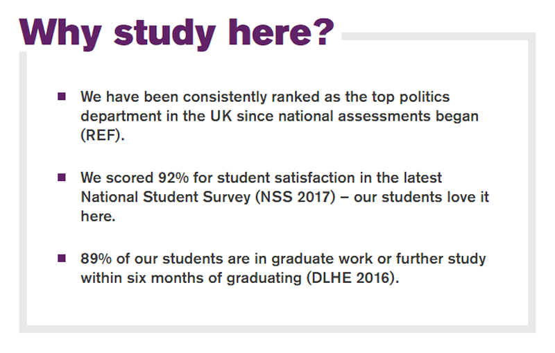
Does your university have a graduate that went on to do something notable? Do you have state-of-the-art facilities? How about an 89% graduate employment rate? These are great benefits that could be one of the deciding factors; don’t miss the opportunity to shout about them (a bit like the University of Essex do);
These tips should help to improve the experience for prospective students and ultimately increase the number of people enrolling on courses at your institute. But remember, with a wealth of students’ associations, libraries and intranets on offer, it doesn’t stop once they’re enrolled on a course. Stay tuned to find out what we’ve learned through research with existing students.
