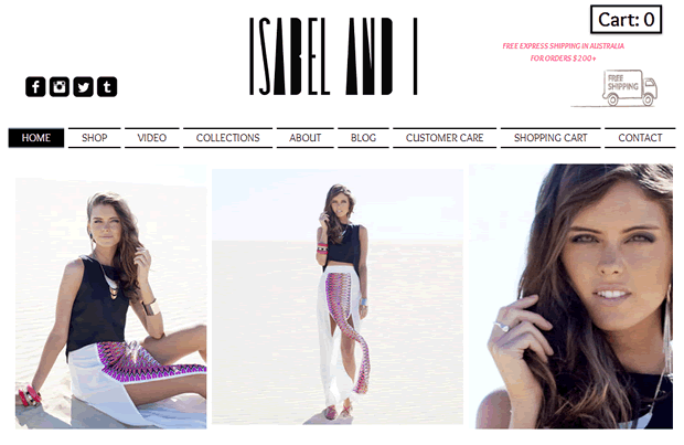
We often receive requests from companies in need of UX advice, and thought this would be relevant to share with our readers. The founder of Isabel and I, a relatively new Australian clothing brand, got in touch asking how to convert a growing social media following into increased paying visitors to the ecommerce site. Her ultimate goal was to ‘convert likes into sales’.
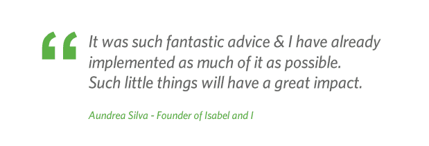
We conducted a user experience audit of the site, where we place ourselves in the shoes of users and travel through the site attempting to complete common customer goals. During our audit we identified several areas where we felt the site would benefit from improvements to the user journey to increase conversions. After sending our report of Isabel and I, Aundrea the owner found our findings really useful. We wanted to share them on our blog in the hope that you would find them useful too.
Recommendations
Accessing the site from Facebook and Instagram
There is great content on Isabel and I’s Facebook and Instagram pages; here are a few pointers to help optimise the conversion from social engagement and encourage users to buy through the ecommerce site.
1. Link images directly to the product page
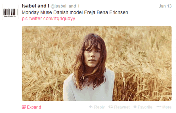
The imagery and endorsements shared on the Isabel and I Facebook page are really encouraging. Unfortunately when the user clicks on an image they are not given any way to continue to the ecommerce site. To find the URL they would need to go back to the header of the Facebook page.
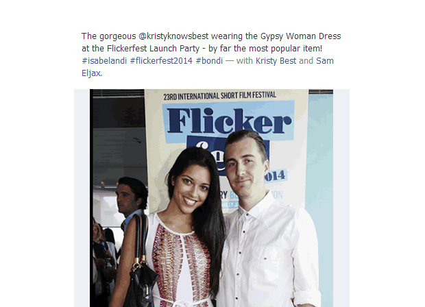
We would recommend including a URL in the headline that links directly to the page showing the product in the photograph. This would create a smooth user journey from a social media like to an online purchase; this approach should be applied across all social media channels.
2. Place strong call to actions in the headline
Copywriting that gives the user a sense of urgency, such as ‘Limited stock available’, is a great way to drive potential sales. Although this idea is being implemented, it is placed in the comments section so it may be overlooked.
We recommend moving this into a more prominent position, such as in the headline with the direct link to the product in the photograph. We have used the above content as an example of how this could be tweaked:
‘The gorgeous @kirstyknowsbest wearing the Gypsy Woman Dress at the Flickerfest Launch Party – get yours at http://bit.ly/1l0M1ad Hurry there’s only limited stock available! #isabelandi #flickerfest2014 #bondi – with Kirsty Best and Sam Eljax’
These two small changes could have a significant impact on the conversion rate, and is an approach applicable to the content on all social media channels.
3. Improve Twitter engagement
We feel the ability to engage with Twitter followers, using the new (in timeline) image feature is not being used to its full potential. The images being shared are inspirational imagery and not direct promotions.
We would recommend using Twitter as an occasional platform for promotions, which ASOS are doing really well. This is a great opportunity to link directly to the promoted product, as mentioned earlier.
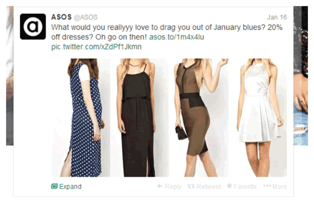
ASOS using the in timeline images to guide visitors from social media to ecommerce
Ecommerce Site
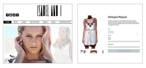
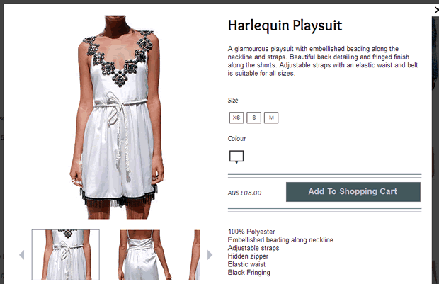
4. Link homepage showcase directly to product
The homepage is a great opportunity to showcase products, which Isabel and I do well. The problem is when the user clicks on an item they like, say the Harlequin Playsuit, they are taken to a grid of product listings. This means the user has to find the item that they originally clicked on, again.
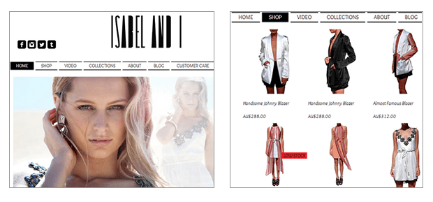
Similar to the approach suggested when sharing content through social channels, we recommend linking product photographs on the homepage to the page that the user can buy from. For example, if the user were to click on the photograph of the Harlequin Playsuit on the homepage, this should link straight to the Harlequin Playsuit product page.
5. Consider the spacing between the product photography and prices
Product listings in a grid format are conventional for most ecommerce sites, however it is important to arrange these so that there is no doubt over which price belongs to which product. Look at the image below, how much do you think a Gypsy Woman Dress is – $288.00 or $90.00?
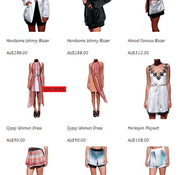
The answer is $90, but it’s not that easy to tell. To avoid users making mistakes, we recommend bringing the price nearer to the product photograph and description, and creating more space between the rows of products.
6. Make the call to action more compelling
The ‘Add to basket’ call to action is pale and does not have much contrast with the rest of the content on the page, meaning it could be easily overlooked.
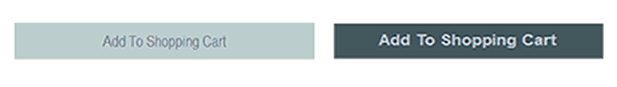
We recommend a more contrasting button design and a position higher on the page itself; this will grab the attention of users quickly. We have mocked up an example of how this could look below.
7. Display returns policy
In our experience, users can be wary of purchasing online without a clear returns policy. We recommend reassuring the user that they can return or exchange an item, by displaying this information at the point of purchase.
Summary
Isabel and I is a good independent ecommerce site, with a developing social media following. Similar online retailers could benefit from capitalising on their social media engagement, and by making small tweaks to the ecommerce sites to improve user experience and optimise conversion rate.
Key Takeaways
- Create strong links between product photography and product listings, in both social media channels and ecommerce
- Use social media to its full potential, such as using the in timeline Twitter images for promotional marketing
- Beware of spacing when designing product listings and ensure the user can link prices to products easily
- Create call to actions that stand out on a page, and encourage the customer to add to the basket
Need our help?
Has this article had you nodding away in agreement? Why not give us a call and see if we can help you. For the next three months we are offering a free UX audit to online retailers, with up to 5 key findings and we recommend how these can be improved. We can help you to drive more visitors to your site via social media, convert more visitors to buyers, or investigate that one thing you think may be causing checkout abandonment.
Take the guess work out of user experience, get in touch and let us tell you how to optimise conversions.
