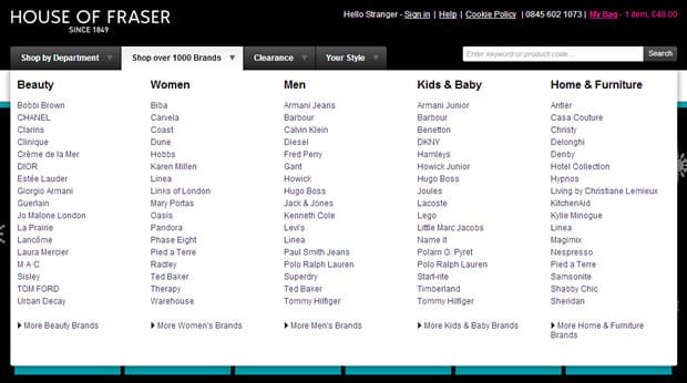
Choosing the right navigation can be a minefield. Before you know it you’ve accidentally stuffed every single option into one gigantic menu, overwhelmed your visitors and deterred them from purchasing from your site. A mega drop down menu has become the popular navigation choice for online retailers, such as House of Fraser, however as with any type of navigation it does have its drawbacks. Despite this, if designed properly these restraints can be overcome and can help to increase conversions and drive online sales.
Here are 4 top tips on how you can improve your mega drop down menus and start seeing results right away:
1. Make browsing categories easier by adding a short delay
One of the biggest challenges users struggle with when using mega drop down menus is accidentally clicking to activate a menu that they did not intend to use, this is called the diagonal problem. A good example of this is on the Debenhams website where their mega drop down acts erratically. This is due to closely spaced tabs and a very low delay time which does not allow for the users’ mouse to travel to the category links without switching over to the next tab. Take a look at the video below to see it in action:
Solving this problem is simple and Nike do it fantastically. Nike’s mega dropdown menu uses a short delay on the speed that the cursor reacts to movement across the tabs ensuring the user’s journey remains fluid and intuitive. Whilst this is a very small change, the difference in user experience is incredibly significant making the menu feel much more comfortable to interact with.
2. Reduce visual clutter
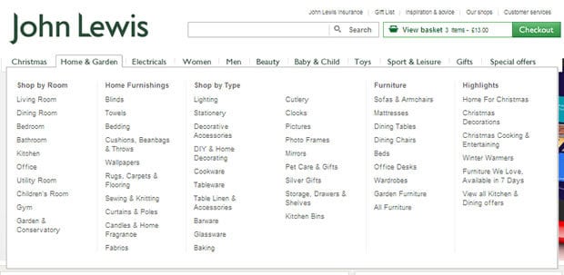
When trying to display a variety of products have you considered how the treatment of the typography can impact the user experience? This is important because a lack of contrast between categories and sub categories can cause the user to click on categories that are not links but in fact headings. An example of this can be seen on the John Lewis site, there is very little contrast between ‘Gifts by Recipient’ and ‘For Her’, as shown below. Not only can this cause frustration, but it can make the information difficult to skim read by category.
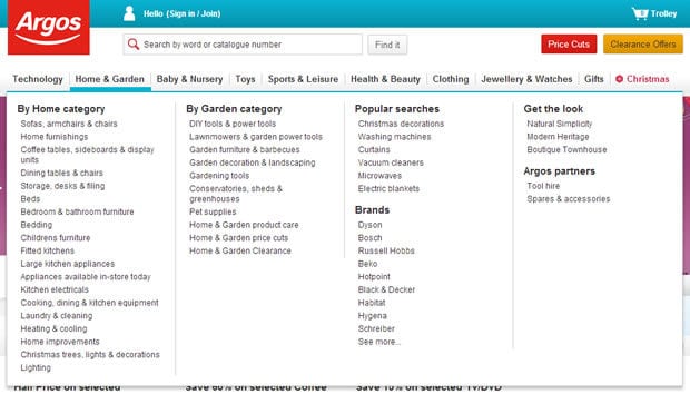
Using typographic rules such as bold or underlined type can create a clear distinction between headings and links. A very quick and simple change, but one that can have a huge impact on conversions. Argos does this brilliantly with a simplistic menu which makes it easy to scan the categories first, choose a relevant group and then scan that group for a specific link within that group:
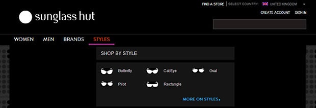
An innovative example of how to easily group navigation choices is to use simple icons. Sunglasses Hut uses icons which are both engaging and quick to interpret:
3. Use a mega drop down menu to increase the average basket spend
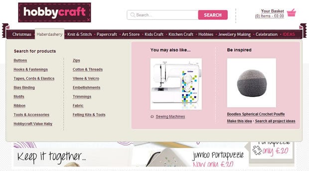
One of the advantages of using mega drop downs is that any extra space can be used to increase conversions by featuring promotions, or suggesting similar products. Hobbycraft use this feature to recommend other products based on the category that the user is selecting, or a product that they are viewing.
4. Darken the homepage to help the user focus on the navigation
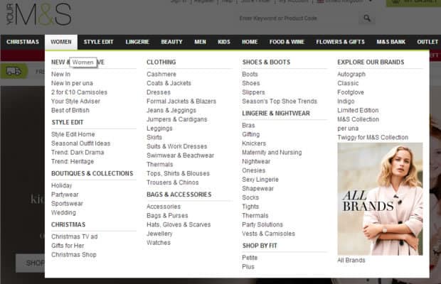
One last thing we wanted to share, is a great technique called turning down the lights. This is a dimmer switch that is primarily used for darkening the rest of the screen whilst watching videos, however, this technique is now being used as a way to increase the prominence of website navigation. M&S have put all the emphasis on their menu by turning down the lights when the navigation is hovered over.
Summary
Mega drop down menus can be a great tool for organising lots of categories on ecommerce websites, but they need to be well considered and implemented carefully. Displaying a lot of information in one place means that this needs to be categorised clearly. Use a strong visual language by contrasting typography of heading and links, and consider communicating categories with simple icons. By making very minor changes to your ecommerce site, such as cursor delay speeds, you could improve the user experience significantly.
Key Takeaways
- Implement a short delay on the speed that the cursor reacts to movement, to ensure smooth navigation
- Reduce visual clutter by using type to create contrast between headings and links
- Consider opportunities to increase average basket spend, but using extra menu space to recommend related products.
Does your ecommerce site suffer from high bounce rates or low conversions? This could be why, get in contact with us to find out how we can help to improve the user experience for your customers.
Further reading
- Mega Menus Work Well for Site Navigation by Jakob Nielsen http://www.nngroup.com/articles/mega-menus-work-well/
- E-commerce drop-down menus: examples and best practices by Graham Charlton http://econsultancy.com/uk/blog/10403-e-commerce-drop-down-menus-examples-and-best-practices
