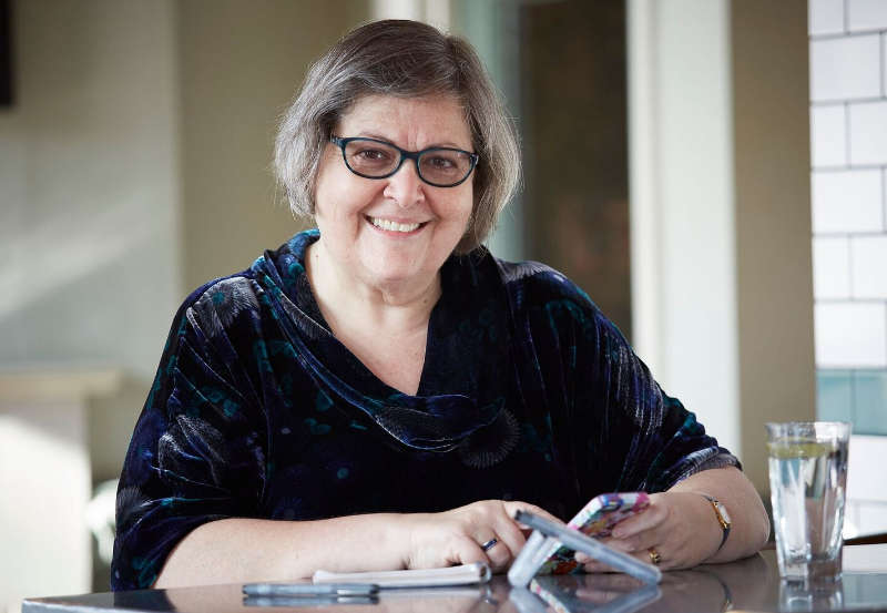
In our latest UX Insider interview, we met up with Caroline Jarrett from Effortmark, to talk about forms and tap into her knowledge on how to formulate the right questions.
Can you tell us a bit about your company and what you do?
I’m a forms specialist and my company, Effortmark Limited, is mostly just me. I started in 1994 and although it’s always been mostly me, I’ve had various alliances with people over the years. As a lone person working in the industry, one of the things I think we do quite often with other specialists is recognise where we can complement each other’s skills. For example, for several years I worked very closely with Whitney Quesenbery, who has her own business in America.
At the moment, I’m doing some work with one of the longest-standing user experience consultancies – TecEd in America. It’s Stephanie Rosenbaum’s user experience business and it’s been going over 40 years. It’s a fascinating and terrifying honour to be working with a business that’s so expert. On the one hand, it means you cut out a lot of the discussion of technical vocabulary, but on the other hand, you think wow, these people have been there and done everything for years, even before I have, so I’d better dial my game right up.
These days, I would say most of my practice is working with people who are experts in their own right. I tend to advise teams that are already doing UX in one shape or another and want a bit of a boost, mostly in my area of being a forms specialist, but across the whole raft of things that I touch on.
I just found I became really fascinated by the problem of ‘how do you make forms easy to fill in?’ And I’ve been fascinated by it ever since.
You’re known as being a forms and survey expert, so where did your passion for forms and surveys come from?
When I teach forms workshops, I always like to test the level of humour in the room by saying: “When other little girls were playing with Barbies I was cutting out form fields and sticking them on paper.” I just see how long it takes for people to realise that’s obviously a complete joke. They normally get it pretty quickly because I have the privilege of working with very bright people.
But the truth of the matter is that I fell into it totally by accident. It started when I was project managing a project for Rank Xerox. They were implementing a system to capture patents for the European Patent Office that relied on optical character recognition. As a result, I learned a lot about optical character recognition in general and how to get computers to read stuff on paper. When I was looking for another job, I found one that was about delivering optical character recognition systems to the Inland Revenue, to process forms. The system didn’t work at all and it was because of the way the forms were filled in. I just found I became really fascinated by the problem of “how do you make forms easy to fill-in?” And I’ve been fascinated by it ever since.
Technology will never solve the problem of asking a bad question.
What’s the most consistent usability issue you see being repeated in forms?
Without a doubt, it’s people thinking that they can solve the problems in forms by addressing the technology and interaction design issues. Yes, the technology must work and the interaction design has to be easy, but what it comes down to is why you are asking the questions. I constantly hear people saying that if they use this new technology, they’ll get better forms. But you won’t, not until you’ve worked out good questions, why you’re asking those questions and what you’re going to do with the answers. Changing technology will never solve the problem of asking a bad question.
In the many years you’ve been working on forms, how have they evolved for better or worse?
When I started out I was working with paper forms and what we would now call enterprise systems, basically the things that people in offices would use to deal with the forms. That meant the computer was for the person dealing with the form and the paper was for the person in the outside world who had to communicate the information.
Then the internet happened. Everyone stopped being interested in paper. For years web forms, web apps, or interactive forms were going to solve all forms problems. We didn’t need to consider paper or how people were dealing with the forms, because that would all be done by the end-users typing in the data correctly. Obviously, that was nonsense. Paper has always been with us and is a very helpful technology.
While paper does have some accessibility problems, for people who can use it, it’s a very convenient medium. And it’s only those of us who work with computers who have this obsession with seeing channels as completely different. People who don’t work with computers expect everything to be integrated and consistent across technologies. Or they may find it convenient to use paper to gather up their answers and then transfer them to computer. You realise having this mix of technologies comes naturally to us.
In the past year, I’ve seen a glimmer of hope. I’ve found people are prepared to consider paper as a viable technology alongside digital. That doesn’t mean to say I’m paper first. I’m digital first, mostly for accessibility reasons and because for most people, being able to do stuff digitally is quicker, easier, and more sensible. Considering both paper and digital as channels that form part of the experience is so much better though.
Paper does have its advantages. It’s incredibly easy to iterate, you can do 10 or 15 versions of a paper form in a day, get your paper process sorted out and then implement it in technology. You can run a new paper process alongside an existing technology very quickly and easily and the implementation times are far shorter.
I’m also seeing a focus back on enterprise systems. People are beginning to understand that the web form doesn’t magically communicate directly with the database without people intervening. You still need the people working in those organisations and if we make their experience good then everyone’s experience is better.
At last, we’re thinking holistically about service design inside and outside of organisations and making it all work together, which is fantastic.
If you weren’t working in UX what would you be doing?
I moved into UX from being a Project Manager. My first job was as a Software Engineer, then I very rapidly turned into a Project Manager/Software Engineer. I guess I would probably still be a project manager and probably that would still be part of UX. I have in the past, delivered pure technology projects that didn’t really have much ‘human’ in them, but even with those, it was always the people aspects that I was interested in. So I imagine that I’d have probably ended up in UX one way or another.
What do you predict will change with the way we interact with forms in the coming years?
Honestly, I don’t know. At the moment, my main research focus is chatbots and conversational interfaces. I’m seeing technologists entranced with the idea that we’ll just be able to speak to the form and it’ll know what we mean. I’m very, very sceptical about this. I still see most people not using Siri for most things, for example. I mean “Hey Siri, tell me the weather” is one thing, but “Hey Siri, where do I declare my capital gains tax for the last year?”, is another.
One of the issues that we come up against when we test people trying to complete forms is a lack of natural behaviour. They don’t always engage very well and don’t fully appreciate the task at hand. Do you have any advice on how to solve that?
I see this all the time. For a number of years, I worked primarily with the Revenue, looking at things like self-assessment. I did lots of testing on the self-assessment tax return back in the 90s and on other associated and different types of Revenue forms. When you’re doing user research for the Inland Revenue as it was then, you’re up against a double whammy. People aren’t sure whether they’re going to be hauled over the coals by the Revenue, and indeed they will be if they’re caught out and cheating, which means you must be very careful about what you promise; and you’re also looking at getting people to engage with a large volume of material that might not be relevant to their circumstances. So we had a lot of problems of unnatural behaviour to consider when we were testing the forms.
Tax forms aren’t the only ones that are tricky. Let’s look at something like a life insurance form: that’s going to have a lot of questions that mean you might have to reveal quite a lot of aspects of your personal circumstances, which you might not even have to hand in an interview situation. As researchers, you have a few options. The ideal would be to find a way of going into the person’s own life and catching them in the moment when they actually decide to fill out that particular form in real life. Or we can try to find people who have already done the task and try to replicate what they did, to draw them into the previous time they had that experience, but in a way that refreshes it and brings it to life as if for the first time.
Or we can create a scenario as if they were doing it for the first time but with information, we’ve prepared. If we do that we’ve got to find a way of getting them to work with a mass of information in the scenario without it becoming sterile, like some task where all they do is copy from a document that means nothing to them into a computer.
My colleagues and I at the Revenue came up with several methods to use in the lab. One of the ones that we found most helpful was what I’d describe as the magic shoebox. This comes from the idea that people keep all their financial records in a shoebox and then get them all out on 30th January and try and work out how to fill in their tax return.
We would explain that we have a box of stuff and say: “As you work through the form, when you’d dive into your own records tell me what thing you’d look for and I’ll see if I’ve got something similar.” So we’re replicating that process of going and looking for information, but we’ve kept it anonymous.
Sometimes I would reverse the roles and say: “Look, I’ve been given this box of stuff. I’ve got to do someone else’s tax return today. You’re my neighbour and I’ve called you in to help, let’s tackle it together.” I then ask questions about what they think should go where. It’s like the Bollywood method, where you create a film-like scenario to get people to engage with the task a bit more.
And sometimes the timing would work out so that we could simply go out and try to catch people as they do it. You ask people to let you know when they’re planning to do that task, and then go to them and watch them. That’s more logistically challenging but even more realistic because then you can go and see literally where they keep their stuff, see if they realised they had to file that particular piece of paper, and so on. That was always rather hard to do with Revenue forms because many of those processes are on an annual cycle and we couldn’t always get the timing right; we usually needed to do research at times of the year when people wouldn’t naturally be doing that task. But for something like life insurance, of course, there are some seasonal factors but it’s something that people might realistically do at any time of year.

It takes time to understand the flows, know what you’re going to do with every answer and think through the business value of every answer compared to not asking the question.
If we were to design a new form tomorrow, how much time should we spend on forming the right questions, vs. the aesthetic design of the form?
Right questions: Five years. Aesthetic design: Five minutes. OK, that’s a joke really. But let’s look at the challenge of working out the right questions. First of all, remember you’re not designing in a vacuum. I think one of Jakob Nielsen’s best contributions to user experience is reminding yourself that everyone spends more time on websites that aren’t yours and everyone spends more time filling in forms that aren’t your one.
If they’re doing this thing, this task that has a form in it, chances are they’re doing it from the context of doing other things. So, find out what they would have done instead, what you are replacing, what you are competing with if you’re a new service, what other questions do people ask in this space, why is your question going to be different from the one they’re expecting to answer? It takes time to understand the flows, know what you’re going to do with every answer and think through the business value of every answer compared to not asking the question. Then there’s progressive disclosure, such as when are we best asking this question to keep this user engaged and interested? It’s very subtle stuff and lots and lots of user research and business analysis has got to go into that.
To get those questions right, you’re doing competitor analysis, you’re doing business analysis, you’re doing user research, you’re doing survey design. You’re doing content design on the words. You’re tuning and iterating to try to get to the exact right mixture that balances a lot of different considerations. You’ll be iterating for the whole time that service is in development and when it’s live.
When it comes to aesthetics it’s a bit simpler. I can change my WordPress theme on my website in 30 seconds in theory, several days and a lot of cursing in practice, but it’s still nothing compared to the effort that’s gone into populating it. I don’t want to trivialise the work done by branding teams and designers because absolutely if it looks good it’s easier to use. And there’s a lot of subtlety in making that happen. I fully admire the skills of the front-end developers who make it easy to do that, who make it robust across all sorts of devices, and so on. They have lots of hard work to do. But once you’ve made the aesthetic decisions, you can probably live with them for a while.
That’s interesting because we often see a preference for fixing the design of a form rather than the questions because that’s easier. Often our solid user experience reason isn’t enough because of business processes that involve sales phone calls, marketing etc. Do you have any advice for dealing with that kind of mindset?
It’s all about value. I’m going to share a shocking secret with you: some people don’t always answer personal details truthfully on the internet. Forcing people into a situation where they’re already untruthful to your organisation because you didn’t respect their need for privacy, that starts them on the wrong foot. You’ve already set out on a damaged relationship with that customer. They didn’t trust you with their personal details, why will they trust you in the future? Respect them and their privacy and their needs to reveal information when it seems relevant to what they’re doing – not before. I’ve never seen people reluctantly put in their true address when they got to the point of buying something and it asked for a shipping address.
What advice could you give me for designing better questions?
There’s no substitute for user research. The more I delve into the world of survey methodology and look at the questionnaire experts and how they design the questions, it’s all about testing, testing, testing. The top-notch survey methodologists make UX-ers look like amateurs when it comes to testing.
Look at the UK and US with their decennial censuses every ten years – they start testing for the next census before they’ve finished the previous one. They examine what each question really means, how those answers are going to be interpreted, whether it’s changed from last year, and whether something has come along that’s added a new topic to the lexicon, which has suddenly become important. You’ll never know whether a question is any good until you’ve watched users try to answer it, listened to how they talk about it, and tested whether the answers they’re giving will actually make sense in the overall design of the service.
Is testing as a survey methodologist similar to a UX-er in that you get people in and give it to them to try out, or is it different?
It’s partly similar to ours and partly different. A good questionnaire designer will always start with lots of interviews on the topic – open interviews to really find out what people’s vocabulary is like and how they think about the topic. We do lots of that. When it comes to actually testing the question itself, the questionnaire designers would do something that they would call cognitive interviewing, which is very similar to usability testing but with a shift in the underlying ethos you approach it with.
So, in a usability test, our watchword is: “if in doubt, shut up and watch.” But in a cognitive interview, you’re nothing without the thought processes. You want the person to articulate every part of their thought process and you will be prepared to interrupt them to make sure that they are telling you what their thought processes are because that’s the absolute nature of the beast.
Do you have an example of a positive impact you’ve had on a form or survey that you can talk about?
One of my favourite examples is from work I did with a big Canadian insurance company on a life insurance form. It was a paper life insurance form, some years ago now, but I always really enjoy this story because it’s such a crystallisation of how brave an organisation has to be. I asked them which areas of the form caused the most difficulty when they processed them in the back end; the biggest problem they had was in the area of designated beneficiaries.
If you’ve worked on life insurance then you’ll probably know what a designated beneficiary means, but for your normal, everyday person in the street, the designated beneficiary just sounds like some arcane insurance term. I suggested that they should change that section to say ‘who gets the money if you die?’. And that’s a very bold, aggressive statement in the world of insurance because it’s introduced some very unpleasant topics: inheritance, death, who gets the money.
But that is actually what the designated beneficiary means and you’ve got to get people to realise that it’s about who gets the money when you die. They were bold enough and they used those words – ‘who gets the money if you die?’. I think they still used the technical term – the designated beneficiary – but they put my phrasing in too and they said the whole behaviour around that section totally changed. It went from the biggest problem they had to deal with to something that wasn’t that big an issue.
Stop trying to make it fun and just make it easy, so people can go and spend more of their lives doing things that are fun.
What’s your position on making forms fun or pleasurable to complete?
I’ve been systematically searching for forms jokes for about 20 years and I’ve collected a good 10 on my ‘Fun with Forms’ page on the ‘forms that work’ website. But actually, I think we should get over ourselves. If we think that filling in a form is fun, we ought to get a life and go out and do something that’s more fun. Go for a walk in the fresh air and see if that was more fun than filling in a form. And if it’s more fun for you, then it’s probably more fun for the people you’re pulling in. So, stop trying to make it fun and just make it easy, so people can go and spend more of their lives doing things that are fun.
I’m not saying that question/answer sequences can’t be fun – lots of us do pub quizzes and enjoy them – but if you’re an insurance company – make it really easy and quick, get out of the way and let people get on with other things in their lives.
Once you’ve worked out all the ‘how’ and ‘why’ parts of a design decision and you need something to tell you ‘how many’, then a survey might be exactly what you want.
What’s the best way to use a survey – i.e. what does a survey do well that other methods can’t do?
A survey is a quantitative method: the result is a number (the survey statistic). I ask people: “what number do you need to make the decision?” If they don’t know what decision they’ll make based on the number that the survey obtains, that’s a big hint that they shouldn’t use a survey.
Putting this more positively, once you’ve worked out all the ‘how’ and ‘why’ parts of a design decision and you need something to tell you ‘how many’, then a survey might be exactly what you want. For example, on GOV.UK they’re doing all sorts of different types of research – web analytics, usability testing, benchmarking, observational user research and lots more. Alongside all of that, they have a survey running that collects some simple answers from users to a short questionnaire. It’s another tool that adds some valuable ‘how many’ insight alongside all the other stuff.
Diversity doesn’t mean that we agree with each other … but it does mean that we need to respect and understand other points of view and other perspectives.
What would you like to see change in the UX industry?
We still need to work hard on diversity. We do have a gender balance that’s probably better than some other parts of the technology space, but we’ve still got a long way to go in terms of whether we truly respect and value all sorts of other types of difference. Every time I hear any of us say, “that person/boss/stakeholder really doesn’t ‘get it’ about UX”, I think, “yes, we still have a diversity problem.” Diversity doesn’t mean that we agree with each other and it doesn’t mean that we accept views that are different from our own – but it does mean that we need to respect and understand other points of view and other perspectives. We should continue to work hard on the ‘UX of UX’
And every time I hear “it’s really hard to find senior user researchers”, I think “we’re not doing enough to encourage people to move into user research, we’re not doing enough to widen the pool of people we consider and to train people who are new”.
You’ve been running a UX business for a long time now, do you have any tips you can share with anyone else running their own business? Or, if you could go back to when you started Effortmark, what advice would you give yourself?
Steve Krug has a great answer to these questions. When people ask him how he got into usability, he says, “it’s too long ago to be useful today.” Back in 1994, so many things were different. On the whole, I think it’s turned out OK and I did the best that I could at the time.
One thing that I started in 2016 and wish I’d done much earlier was to give myself a clear set of working hours each week, and have a policy for annual leave, sick leave and compassionate leave – then to track my hours of work and award myself time off in lieu. Obviously, as my own employer, I can vary the rules if I want to and I don’t have too many silly arguments with myself about them, but it’s helped me to realise that I need time off and it makes me more productive overall. As a person running your own business, it’s entirely up to you if you want to set a working week of five hours, 75 hours, or anything in between, but it’s helped me to be more careful and explicit about it. It’s helped me to know when I can say ‘yes’ or must say ‘no’ when someone asks me to do something.
Whether I’m doing user research myself, or hearing about user research that other people are doing, it’s always inspiring.
Where do you go for inspiration?
User research. Watching people use something, learning why they’re using it. For the last few years, most of my user research has been with designers, developers, user researchers and other UX colleagues. My most ‘meta’ job has been doing user research with user researchers on advice about how to do user research, which was fascinating (if a bit mind-bending). But whether I’m doing user research myself, or hearing about user research that other people are doing, it’s always inspiring.
August 2021 Update:
Caroline has recently launched a new book, Surveys That Work, A Practical Guide for Designing and Running Better Surveys.
Thanks for reading. You can find Caroline on Twitter: @cjforms. If you would like to be interviewed, or you’d like us to interview anyone in particular, please get in contact.
