In a very short space of time the Hamburger menu became a convention for mobile navigation. But it was a convention that didn’t have the support of many of the UX community and the signs suggest that it’s time may be coming to an end.
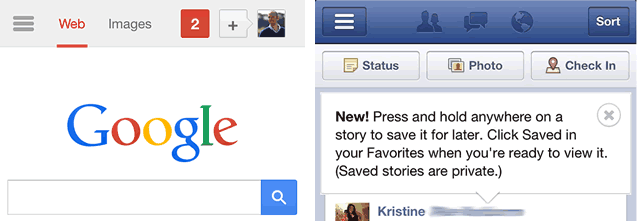
Whilst the history of the Hamburger icon dates back to the very first interfaces such as the Xerox Star, it arose to popularity when it was used in an early Facebook app and on Google’s mobile interface.
Giving users a traditional navigation menu when screen real estate is limited is very difficult to achieve. So it’s easy to see why interface designers adopted the hamburger icon as their solution. It took up very little room, and everyone else was using it so why not. Whilst those designers and their colleagues knew what the icon meant, the average user didn’t. There have been several usability studies, including our own, that proved that users didn’t associate the three lines with a navigation menu. But despite the growing body of research against it, the hamburger has lived on and is still considered to be the right solution by many.
Is the Hamburger icon about to fade in popularity?
However, many of the popular apps now favour a more traditional bottom navigation bar including Twitter, Instagram, and Pinterest. In fact the newest version of AirBnB’s app has just dropped the Hamburger in favour of a bottom navigation bar too. Is this the beginning of the end for the Hamburger icon in favour of more traditional navigation conventions?

What do you think?
[Tweet “Is this the beginning of the end for the Hamburger icon in favour of more traditional navigation?”]