Fat Face have recently hit the headlines declaring a 39% increase in ecommerce sales, following the relaunch of their website. We were intrigued to find out what had changed to trigger such an increase in sales, so we carried out a brief usability review. Although we would always champion usability testing as the only true test of user experience, we wanted to share with you some of the things we like about the Fat Face website.
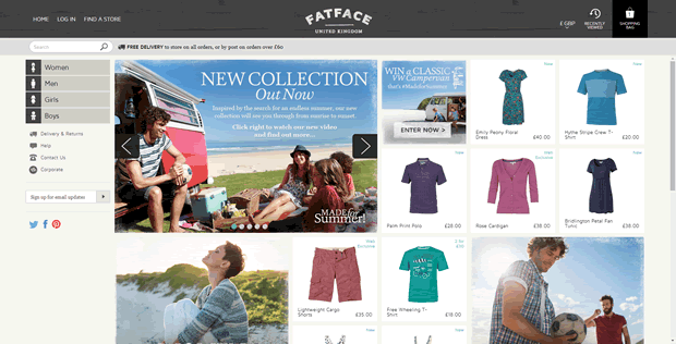
Fat Face provide inspirational browsing on the homepage
It’s clear from first impressions that Fat Face have made a conscious effort to step away from the conventions with this redesign. The mosaic style homepage is very similar to the Pinterest approach, and makes for an inspirational browsing experience. This visual style is aimed at encouraging a higher average basket value by showcasing items for all genders and ages; chances are whilst browsing for yourself you may spot something your other half would like.
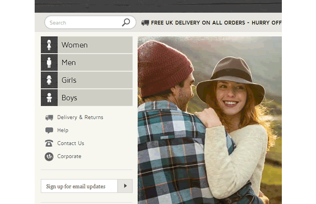
Transparent delivery, help and contact information
Fat Face understand that it’s key to reassure users in their decision making process by being upfront about delivery costs and contact details. Hence the prominent placement of ‘Delivery & Returns’ and ‘Contact Us’ in the navigation, in contrary to many sites where these links are placed in the footer. We have seen during previous usability testing that this information is important for online shoppers, and gives them more confidence with their purchase decision. The use of icons in the left hand navigation is also a clever way to break up the text and makes for an easier selection.
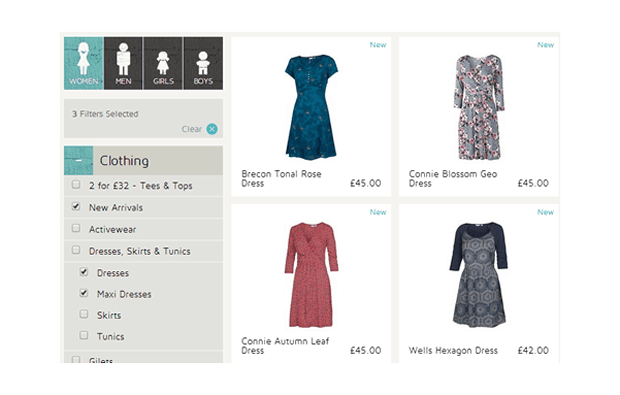
Smooth navigation that doubles up as a filtering tool
At the secondary level, the primary navigation switches to a horizontal layout which takes up less space but still makes it easy to return to the top level. The secondary navigation acts as both a way to navigate the site and as a filtering tool making for a smooth experience, giving the user the opportunity to select more than one product category at once.
Making it easy to compare products
Being able to see a quick view of a product (by clicking the eye icon) without having to go to the product page makes it easy to compare similar products without too much interaction (the less curious of users, however, may miss this icon). The recently viewed (clock icon) is also elusive, but helps to recap all those items you’ve been looking at before making a decision.
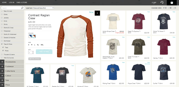
Fat Face have removed the individual product pages and instead display products in a lightbox. This approach works well as the user can easily view and compare products without going back and forth between product pages.
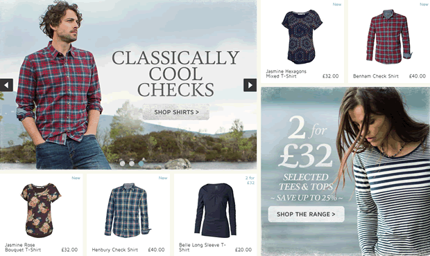
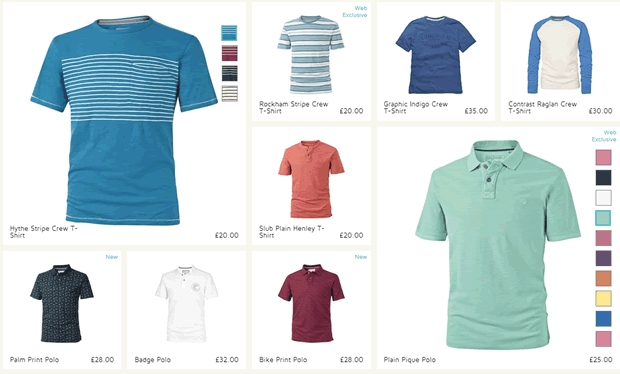
There are a variety of ways to show different colour options
It’s very common for retailers to offer a product in more than one colour or pattern, but often this isn’t clear until the user reaches the product page itself. Fat Face employ two different methods for showing colour options. For some products, the size of the product tile depends on how many colour variations are available. For example a pair of shorts that comes in only one colour is presented in a small tile, but a t-shirt with multiple colour variations is presented in a larger tile. This approach leads to a more useful and engaging interface of different sized product layouts.
Another, more subtle, approach is a feature where the colours available are shown on mouse rollover. Although it’s refreshing to see this problem being dealt with in different ways, we wonder if users will notice this feature straight away.
Fat Face – a mouse rollover to show different colour options from Experience UX on Vimeo.
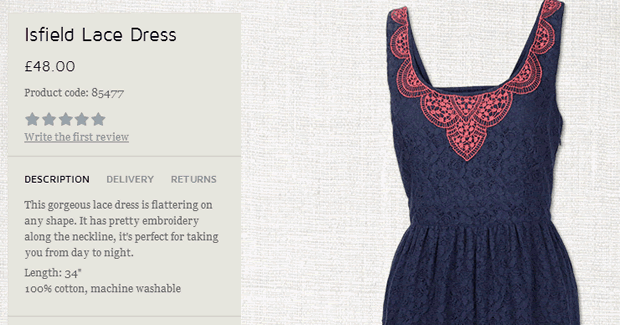
Friendly and upbeat product descriptions
From our usability testing research, we’ve learned that a good product page isn’t solely down to good imagery and clear information; an injection of brand personality and a friendly tone can go a long way to engage users. Fat Face do this really well by using short, upbeat and casual product descriptions which fits well with their brand. This personal touch mirrors the in-store experience and feels more like the friendly advice given by one of the shop assistants.
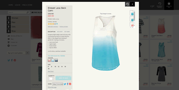
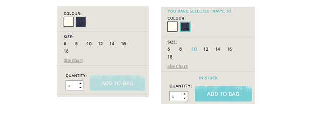
The use of good design to reduce user errors
Online retailers can use colour and typographic treatments to help users through the selection process and avoid user error. In this example, an accent colour is used to signify when both a colour and size have been selected. The ‘Add to bag’ button is also inactive until a colour and size variation has been selected, reducing the chance of this common user error.
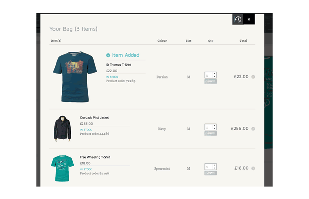
Attention to detail
Although they don’t have a significant impact on user experience, a combination of subtle touches can certainly make for a positive experience. In the basket page, for example, the last item added to the basket is displayed at the top of the page and noticeably larger than the previous items, giving it an increased prominence.
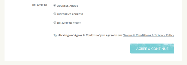
No unnecessary user interactions
Forgetting to tick the T&Cs checkbox at the end of a checkout process is a notorious UX problem that we’ve witnessed countless times during usability testing. We often recommend using an ‘Agree & Continue’ button to our clients, who see fewer usability issues after implementation, so we were delighted to see Fat Face using this approach.
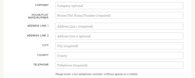
The not so good
During our review, we did notice some usability issues with the site. We experienced several frustrating bugs while evaluating the site which made buying a product sometimes difficult. Also, after the enjoyment of navigating and selecting a product, the checkout process was a major let down. The forms used throughout the process were long and cluttered and were made worse by replicating the field names inside each field.
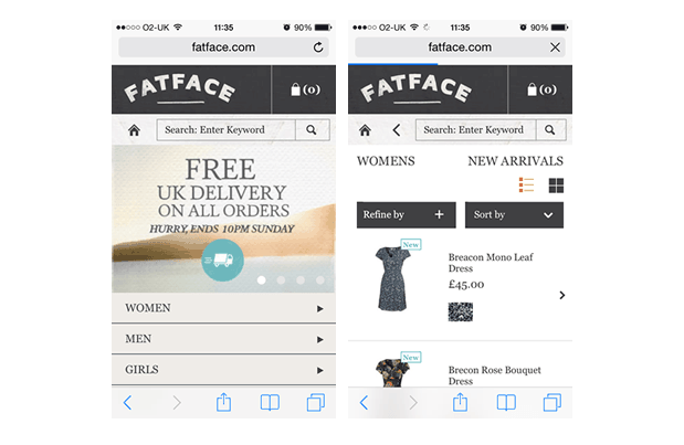
Tablet and mobile experience
Unfortunately the mosaic style homepage and quirky transitions on the desktop, didn’t translate well when using a tablet. Load times on the tablet were much longer than acceptable, reducing the browsing experience significantly. The dedicated mobile site was fine and followed the more conventional mobile format but unfortunately is was lacking the nice UX touches and wow factor of the desktop site.
Summary
It’s clear that Fat Face have taken user experience into account during this redesign. From the product listing pages that make it easy to compare products, to the design touches that simplify adding a product to the basket. One of our favourites is the left hand navigation that doubles up as a filtering tool, what a great way to utilise space!
The website is refreshingly unconventional yet it doesn’t move too far away from conventions to confuse or alienate users. We would like to see other online retailers push the boundaries and adopt similar innovative approaches. We have covered more inventive ecommerce examples in a recent article: “5 beautifully designed ecommerce sites that entice shoppers to buy”.
We are experts in ecommerce usability Get in touch for a free informal chat with one of our usability experts.
